South central wine

WHAT WE DID
Black America has been the springboard for ideas and creative concepts for years. Yet, for even longer, that creativity’s been poached, repackaged, and sold, making other communities multiple avenues of generational wealth. This tradition leaves the world with what’s left of the story, trauma, hardships, and twisted depictions through half-truths and false narratives. While many alcohol brands have leveraged Black culture as a marketing vehicle, the wine industry especially has not done a great job of speaking and appealing to the Black community.
Our founder, Sanja Komljenovic, has collaborated with Stephanie Owens to break this elitist cycle and break into this industry using a big idea—and a small can of wine.
Strategy
Creative Concepting
Brand Identity/Book
Photography
Organic Social
Website & Emails
Strategy
This brand’s purpose is to initiate the much-needed conversations that will steer the story towards the truth. South Central, LA and many Black and brown communities like it are hubs of style, art, innovation, and genuinely authentic expression. In addition to providing the finest of wines, we aim to serve the community to which we —and the world at large— owe so much for its contributions and groundbreaking culture.
We want to educate people who may not know the scope of Black America’s influence and the history, good and bad, that created it. South Central Wine’s name and overall concept represent the juxtaposition of things that make a beautifully unexpected pairing: wine and Black American culture. Both are undeniably rich.

Creative concepting
Some people view wine as an exclusive club, fancy glasses, important people who say important things and then laugh in the same tone for controlled short bursts. The gatekeeping of the wine industry echoes larger power imbalances in our society. But when it comes down to it, wine is created by a simple collaboration: farmers and grapes. There is nothing pretentious about that, and it’s about time we give wine back to the people.
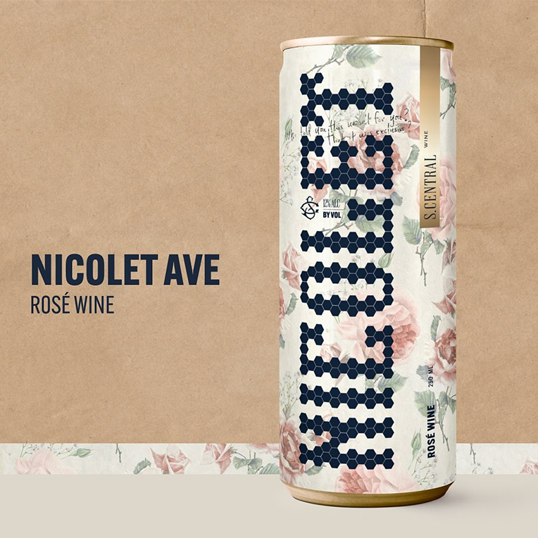
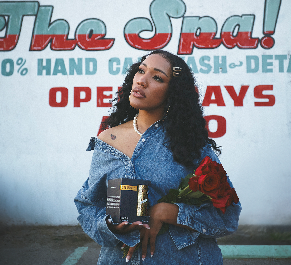
SCW blends the glamor of a glass of wine with the convenience of a can. Accessibility is at the core of this brand, both in product and in storytelling with a focus on the history of South Central. Each can explains a relevant concept using narrative and poetic writing. For example, the first release was a rosé that characterized Nicolet Ave’s neighborhood as “the rose that grew from the concrete.” This particular street holds significance because it’s where one of the founders, James, is from.

Before there was hip-hop in South Central, there was jazz. The latter is much like wine, often associated with Eurocentric elitism. Classy. Refined. Inaccessible? Not to us. We combined visual elements of jazz culture and street signage from the area to create a look and feel that’s upscale without being uppity.
BRAND IDENTITY/Book
LOGOS
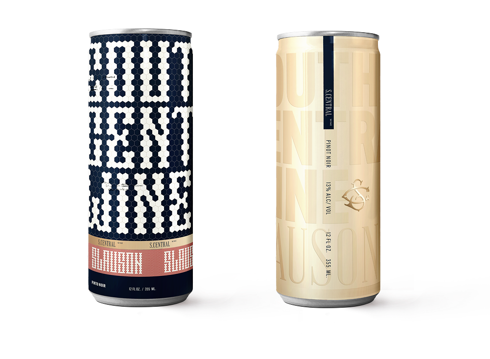
The primary logo mark is designed to mimic a street sign. Many of the cans feature street names from the area, with companion stories that describe their historical and cultural relevance.
Our secondary logo mark features a border that, like the font, is a little rough around the edges. The same can be said about South Central, as an area that’s faced unsavory circumstances but produced culture that has sweetened the cultural zeitgeist.


The primary logo symbol is a graffiti rose that has the letters SCW in it (if you look closely). It also functions as a nod to our rośe and in terms of storytelling, it aligns with Tupac’s poem and book of the same name, “The Rose That Grew From Concrete.” We feel that this speaks to the resilience of Black and brown communities in America.
The secondary logo symbol resembles a skeleton key and lock, which were primarily used until the ’40s. In addition to the jazz culture visual cue, this logo symbol also represents the invitation to unlock the history of South Central, exposing you to the culture on a deeper level.
TEXTURES

The vintage flower print is inspired by the wallpaper one would find in a jazz bar.

We added a brown paper bag texture to marry posh with practical. Among other uses, when you buy wine, it’s usually carried in brown paper bags.

The hexagon patterns are modeled after the floors found in jazz bars.
PACKAGING
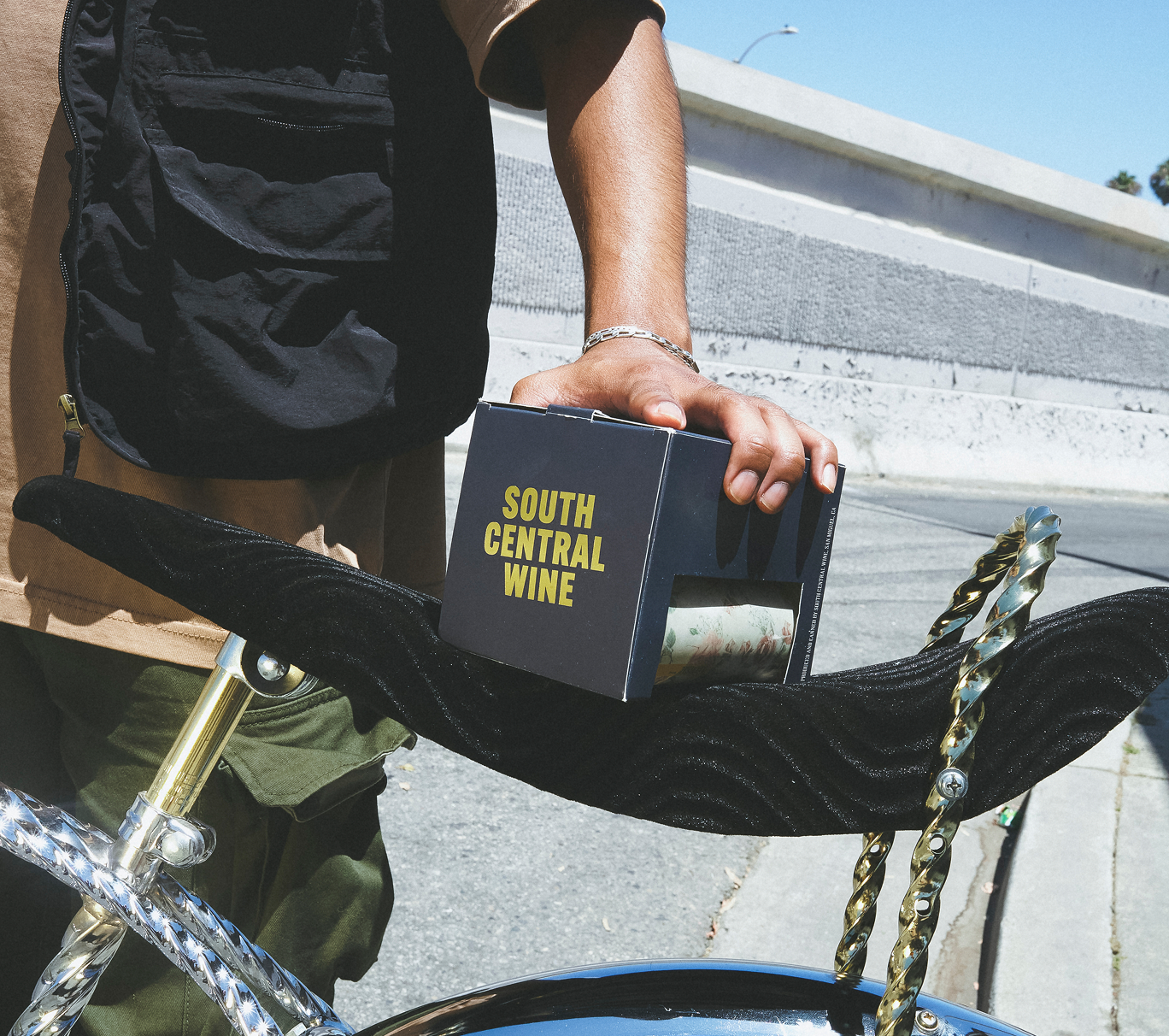
Using design elements like the floral prints and lines from our manifesto in a founder’s handwriting, we developed the cans and boxes for SCW. Each detail is meant to reflect part of South Central’s history and culture. It’s not good to keep things bottled up. That’s why we chose a can.


The value of merch is that it allows people to feel connected to the brand, and support it outside of buying the primary product. Lifestyle items offer advertising opportunities to build equity in the logo, iconography, and brand colors. Our merch lineup included a cap, T-shirts, and sweatshirts. The hat features the rose symbol and all the other apparel has the tagline “Straight from the Source.” The phrase refers to cultural elements from South Central and the larger Black community in America that are often imitated by brands.
MERCH


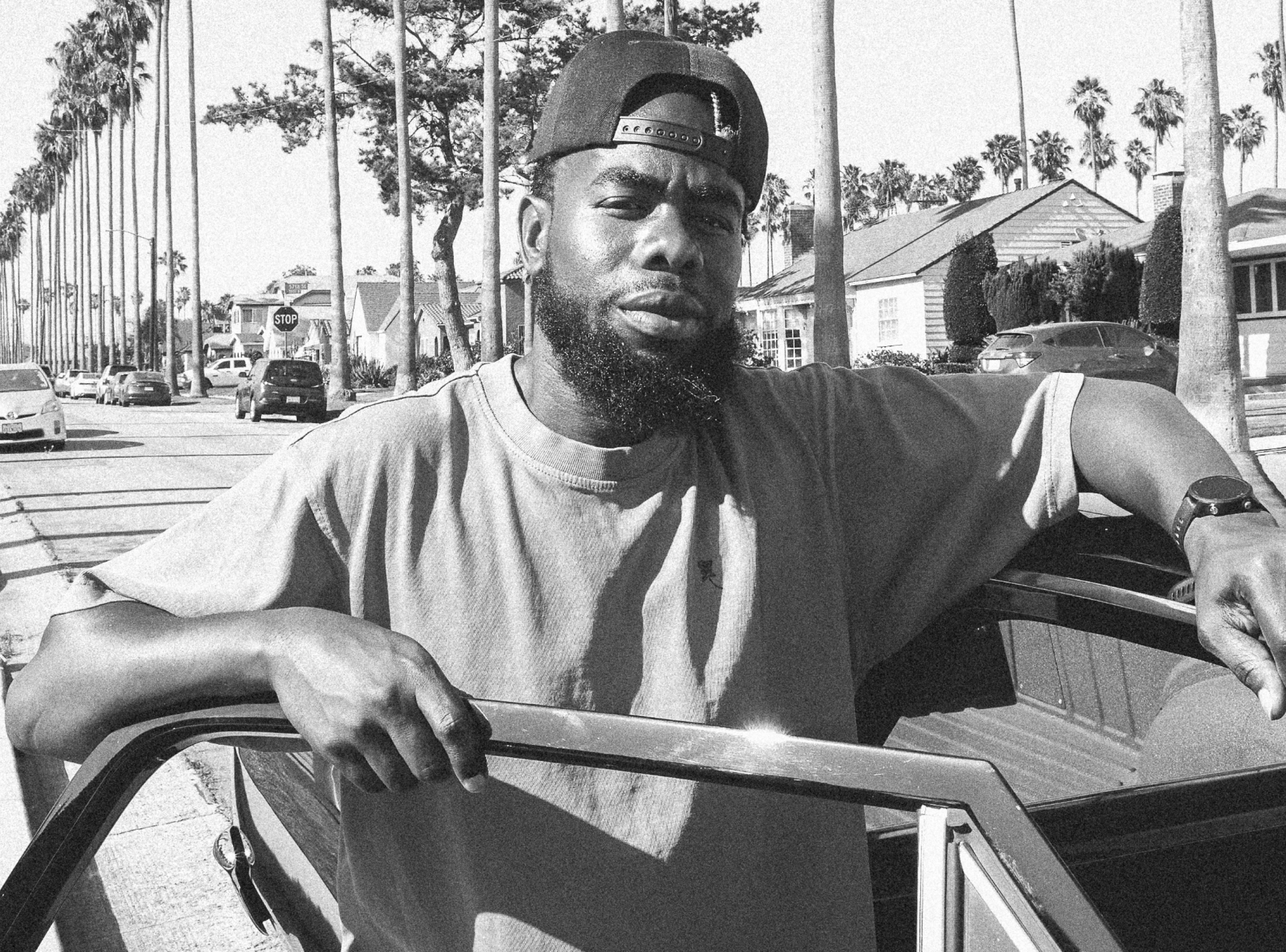
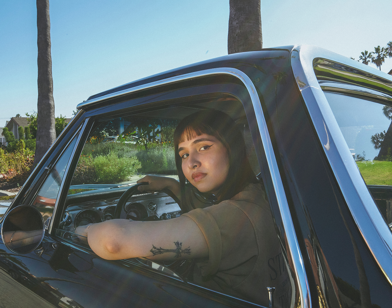
This shoot spotlighted people with strong connections to South Central, ranging from those who found success outside of the area with community support, to those who brought the community together through shared interests. The creative direction’s main goal was authenticity in who we cast and where we went, including Chef Keith, the owner of Alta Adams; to South LA Wine Club founder Lindsay, who we shot in front of a classic LA home; and Chris Young, who received funding from Arlington Market to start his basketball clinic for youth in the area.
The black-and-white images provide a nostalgic feel of the area pre-gentrification and the images in color explore the lively beauty of South Central. Much of the aesthetic was inspired by the 1980s and ’90s artists who have turned locations like Slauson Donuts and Hungry Harold’s into editorial venues.
photography


We built a full e-commerce website that houses information about the overall brand and each specific product. There’s an individual page for every can that has its full narrative in addition to the purchasing information. There is a section for people to leave reviews and a feature for email capture. For this email list, we drafted a strategy that placed each email into one of four categories: acquisition, retention, information, and promotion.
Website & emails
Social media gives audiences a closer look at the what and why of the brand. Content is split between product info and updates and storytelling posts about South Central and its residents. The grid is organized in a three-post sequence that has one subject per row. For example, one row tells the story of Lindsay and the South LA Wine Club, while the next explains an element of the brand like the visual language of the primary and secondary logos.