DECADA

Década wanted to bring artisanal craft cocktails to the ready-to-drink space by using their award-winning, super premium tequila as the main differentiator compared to others, allowing consumers to drink high quality, fun spirits in any setting.
Upon assessing the more vintage, trendy, and even cheap competition, they wanted to go in an upscale direction.
WHAT WE DID
Brand Identity
Packaging
Social Content
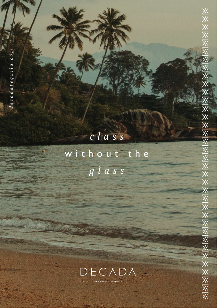
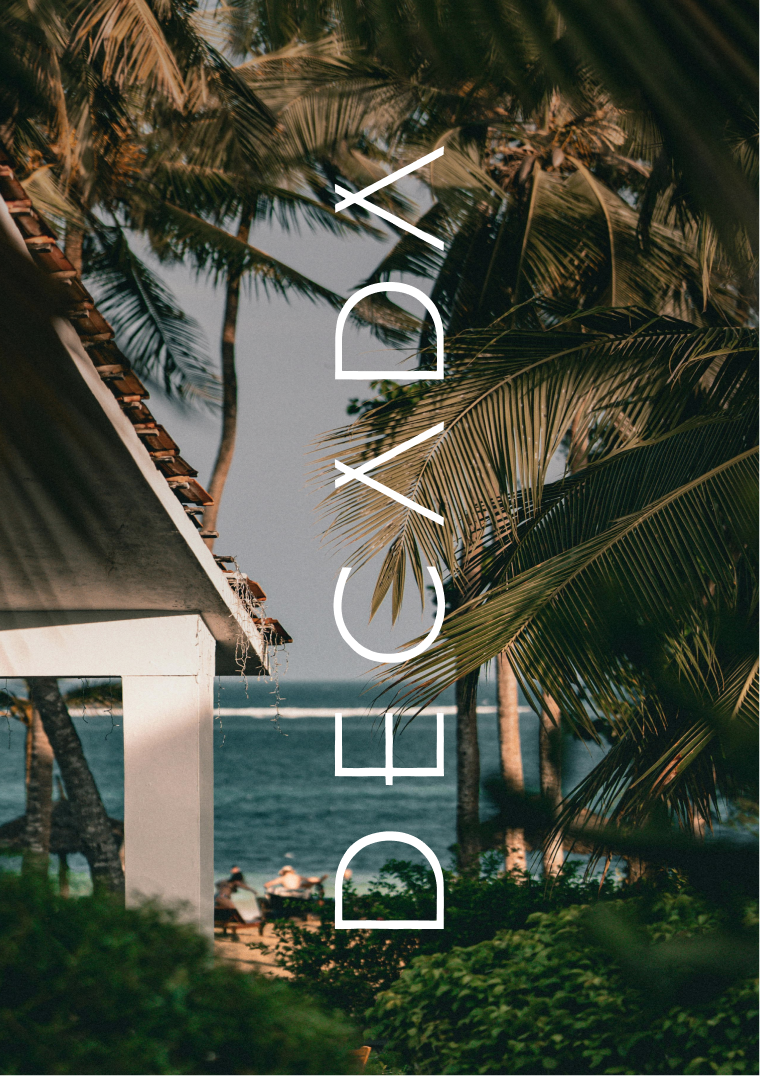
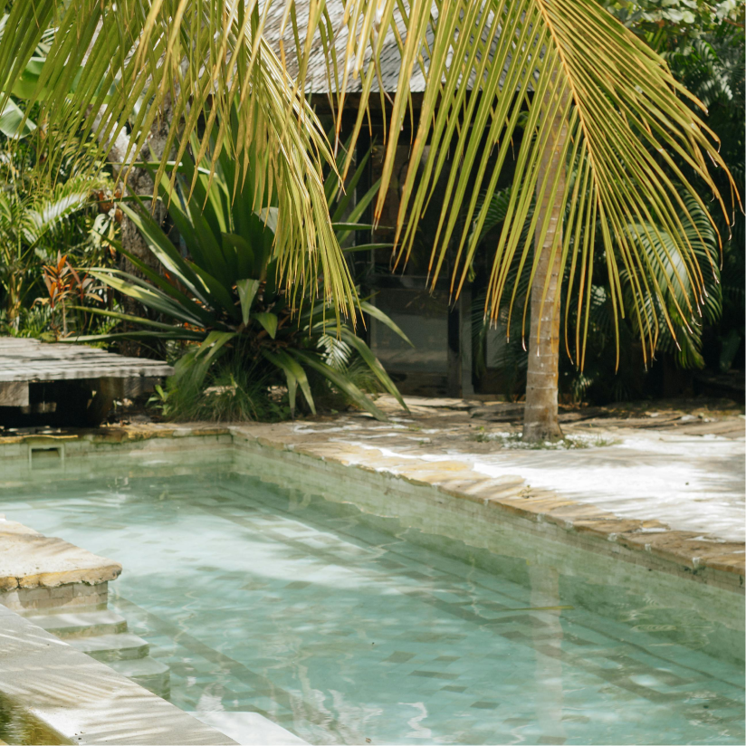
Sensible Luxury was the basis of this brand’s identity. Sophisticated, refined, timeless, elevated, premium, fashion-forward, and artistic. “Luxury Libation” and “Natural Paradise” were the visual pillars, but it was also meant to look approachable. It’s slightly feminine, and not necessarily loud, but fun.
BRAND IDENTITY


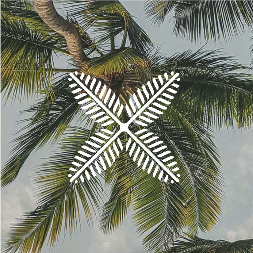
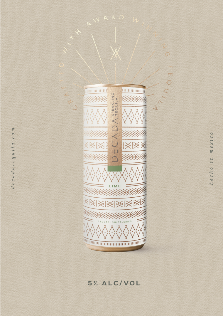
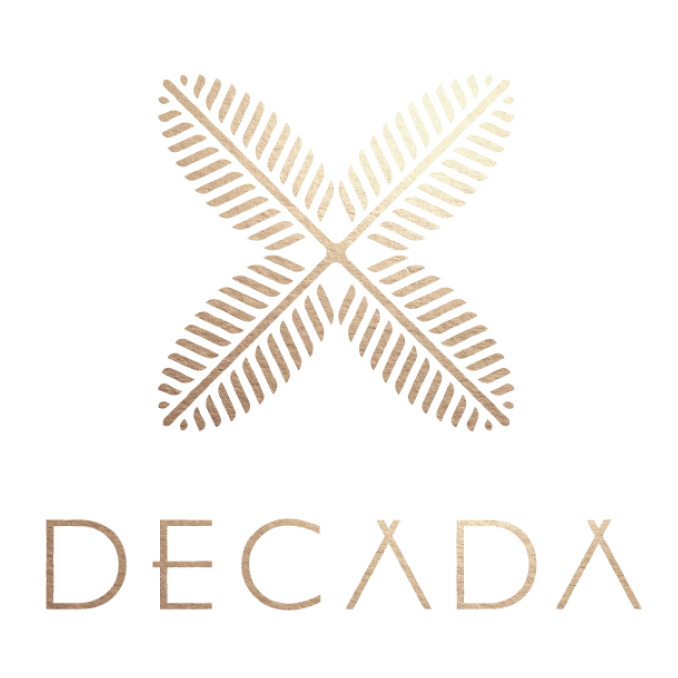
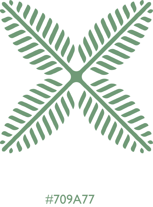
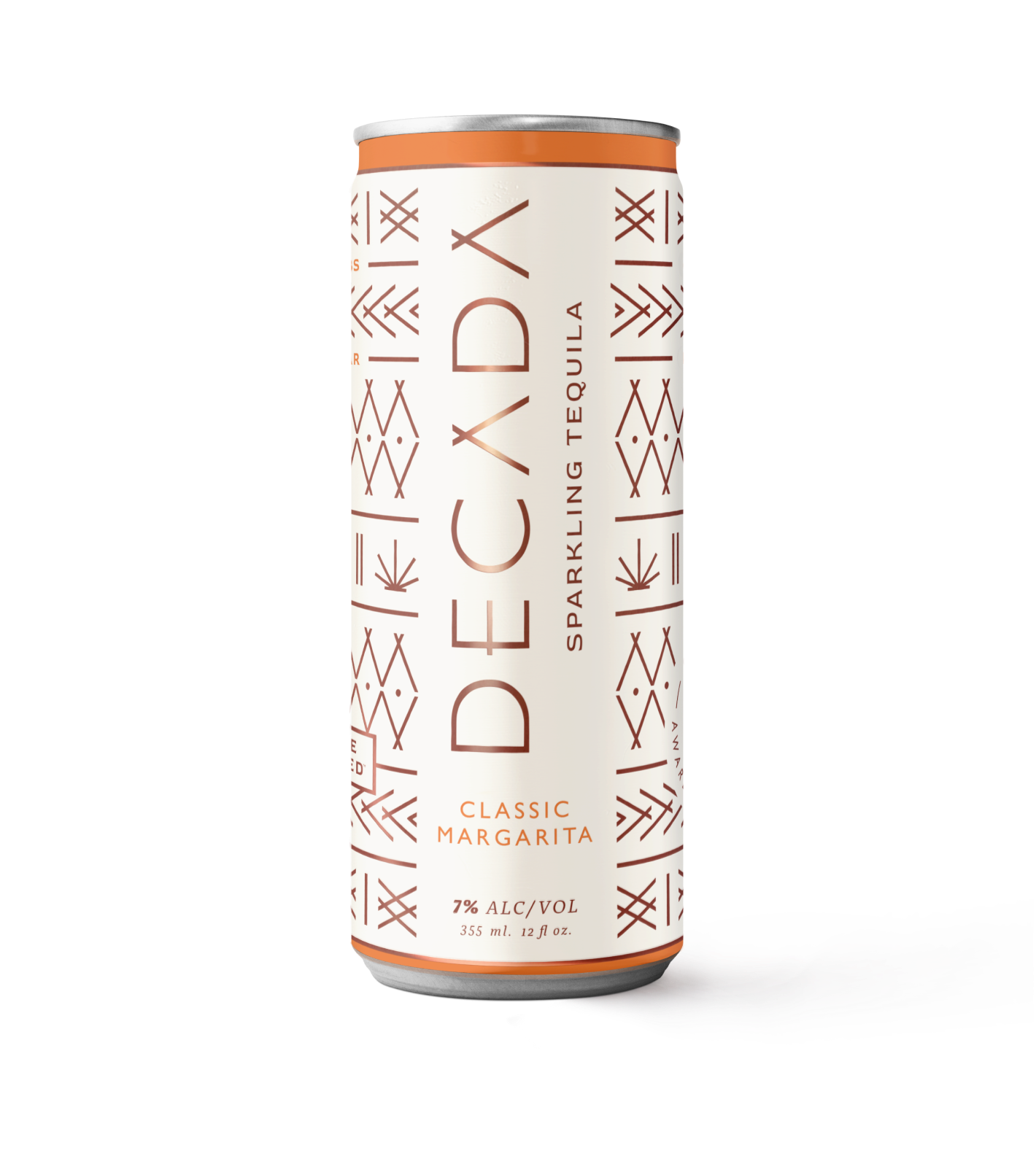
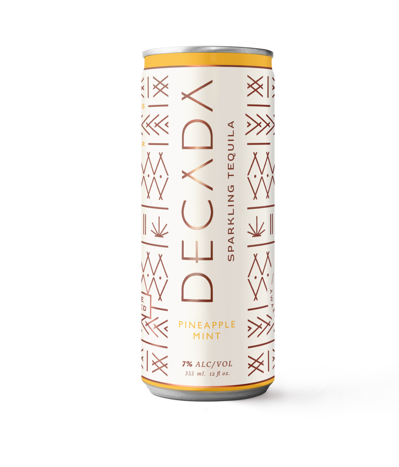
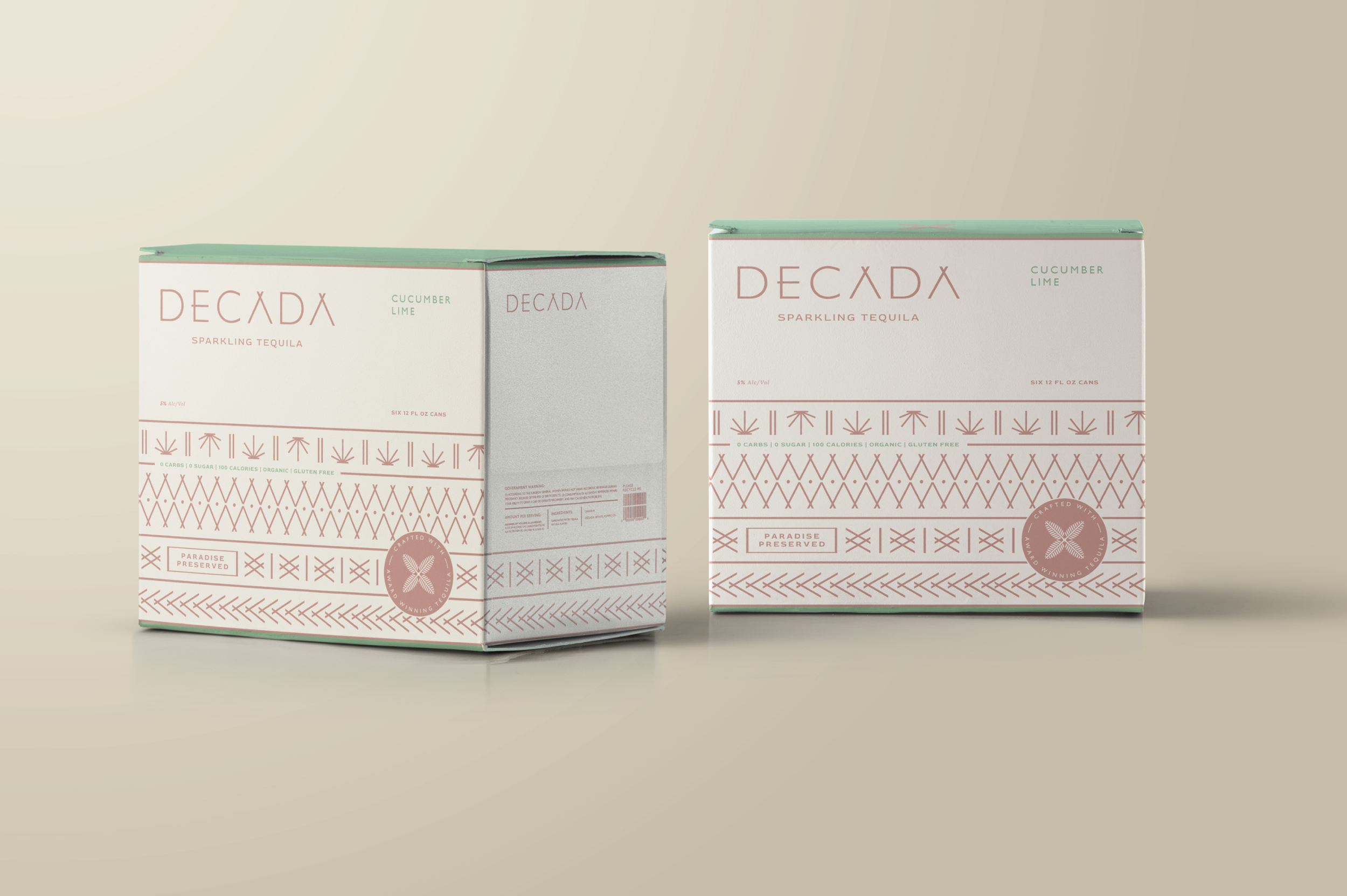
We designed the Década logos to embody natural simplicity and refinement. The "X" icon, inspired by palm leaves and the agave plant, serves as a nod to beach days and tequila production. By blending organic elements with contemporary design, we were able to evoke imagery of sun-kissed days on golden sands, much like the drink itself—captivating and refreshing.
LOGOS

The clean, minimal typography reflects the sophistication and premium craftsmanship of the tequila.
Typography
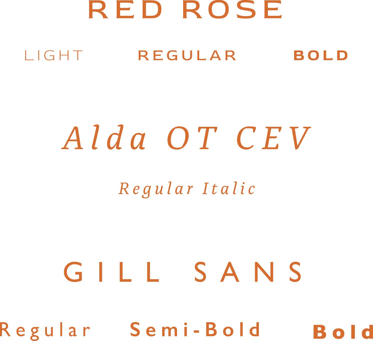
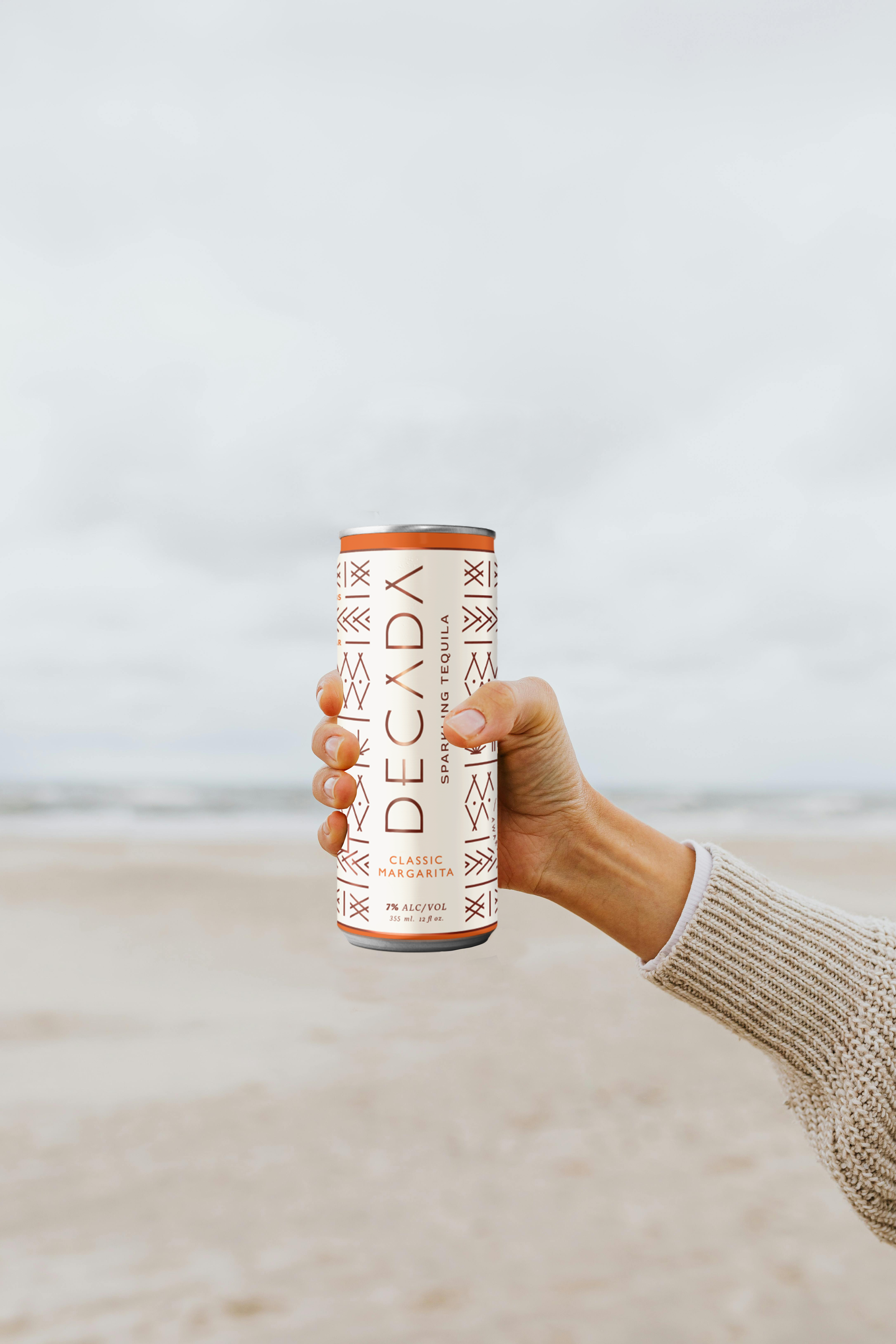
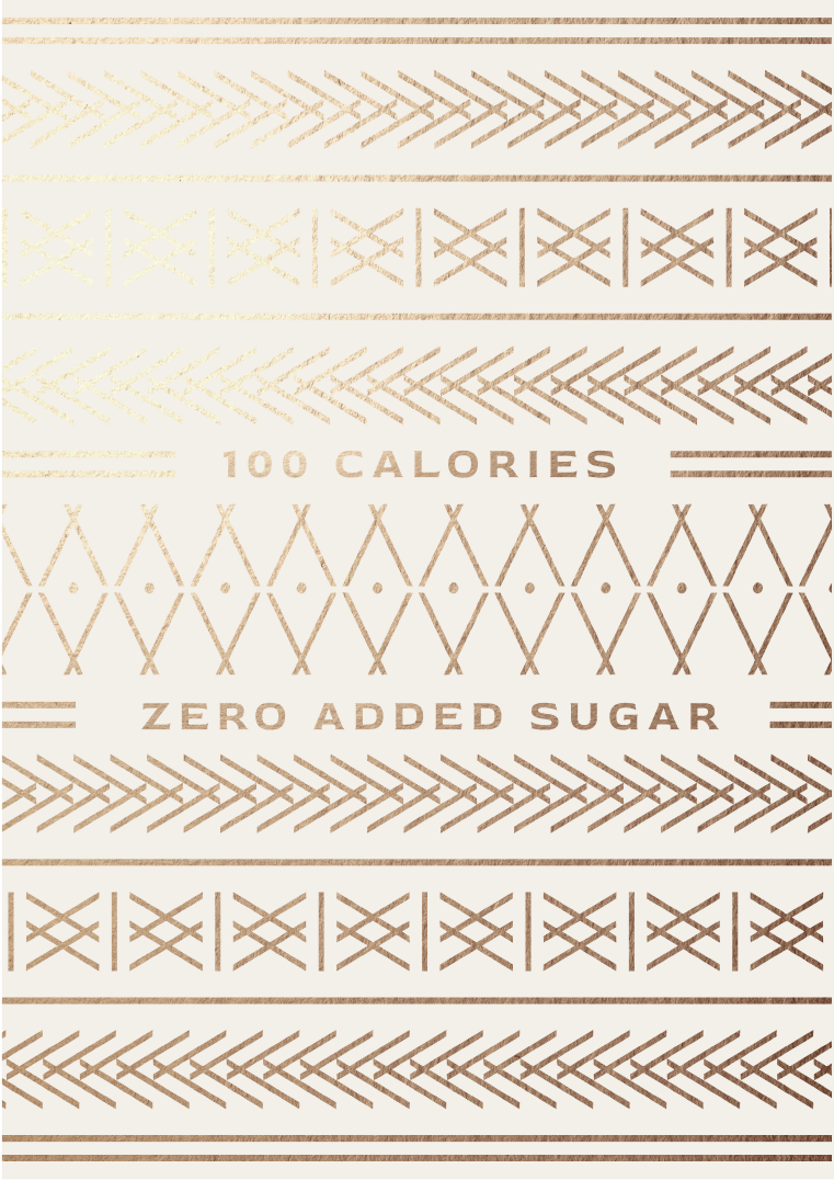
The color palette includes lush agave green; a warm, sandy beige; soft terra-cotta; and luxurious pops of gold.
COLOR


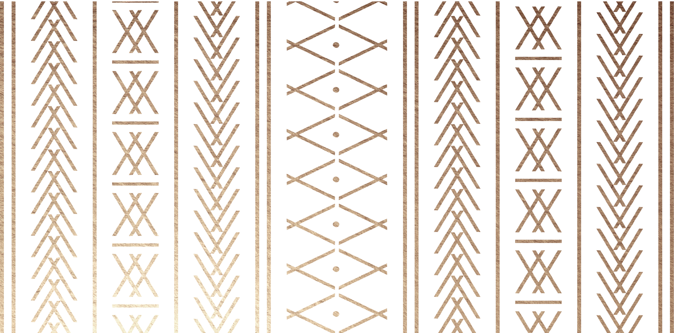
The primary pattern is a contemporary take on traditional Mexican design. Some of the iconography represents the sun and some is a combination of both As in the brand’s name.
PATTERN

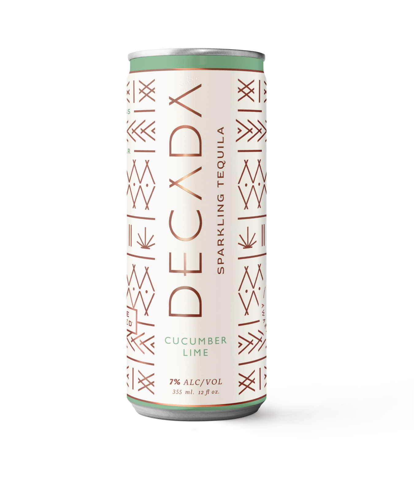
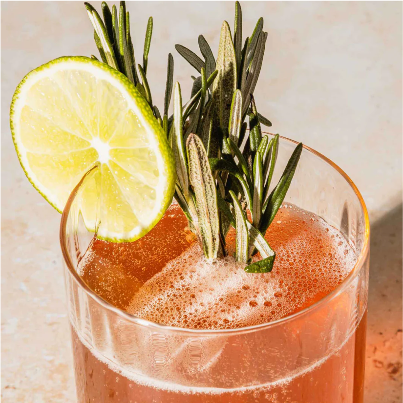
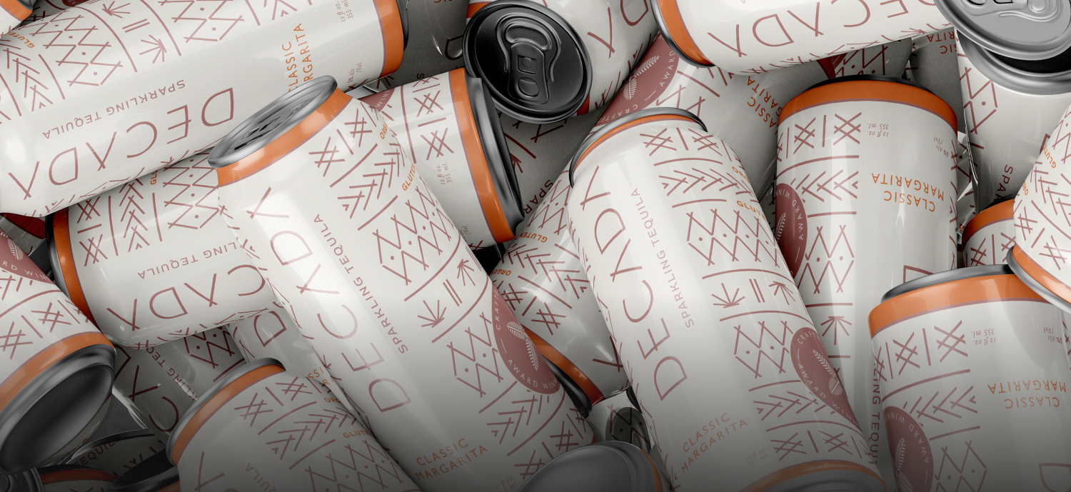
The packaging reflects the refreshing flavors of cucumber-lime, classic margarita, watermelon-lime, and pineapple-mint. The ultimate goal was for it to capture attention on the shelves, setting it apart from competing cocktails.
PACKAGING
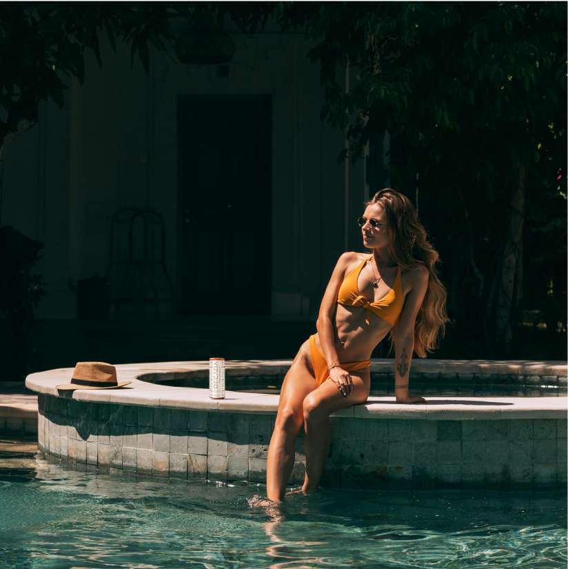
To show how these designs would come to life, we also mocked up examples of Instagram posts and guided their grid to best showcase the work.
social content