What We Did
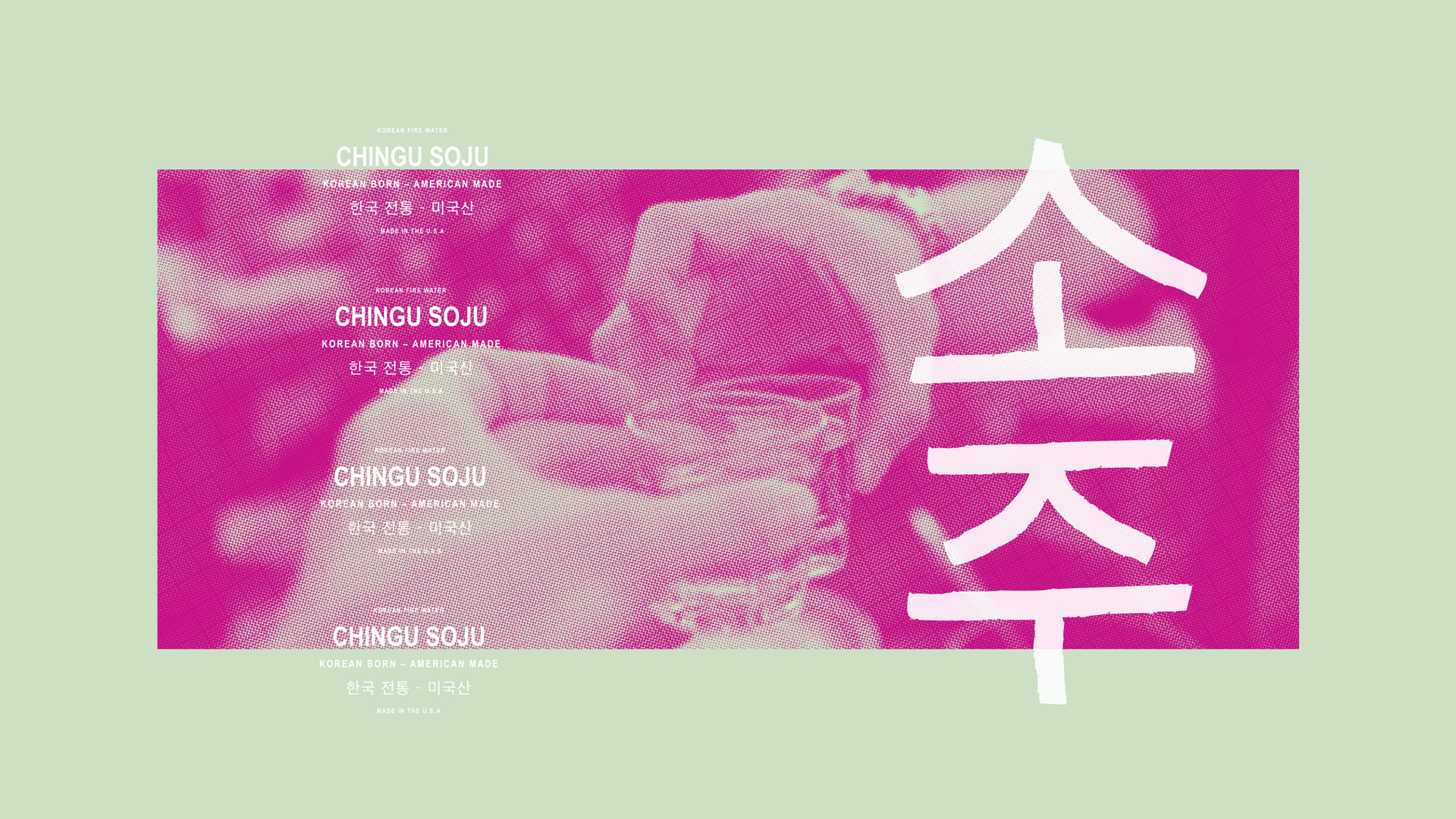
Soju is a clear, low-alcohol, distilled spirit. It is the most popular liquor in Korea and the best-selling liquor in the world. Named Chingu—meaning “friend” in Korean—Chingu Soju was created by three childhood friends.
We positioned Chingu Soju to make sure that the product branding was rooted in tradition but still appealed to today’s young consumer: Gen Z and Millennials.
The client did not want the brand to appear fancy, elitist, or luxurious, but to instead exude camaraderie and tradition—to be accessible to the everyday man.
Brand Identity
Packaging

Colors
Colors were selected to set Chingu apart from the competition. The bold, trendy palette is perfect for the young consumer who values freedom of expression.


Logo
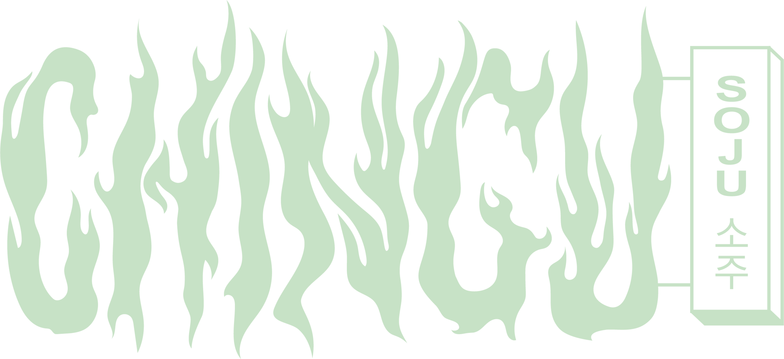
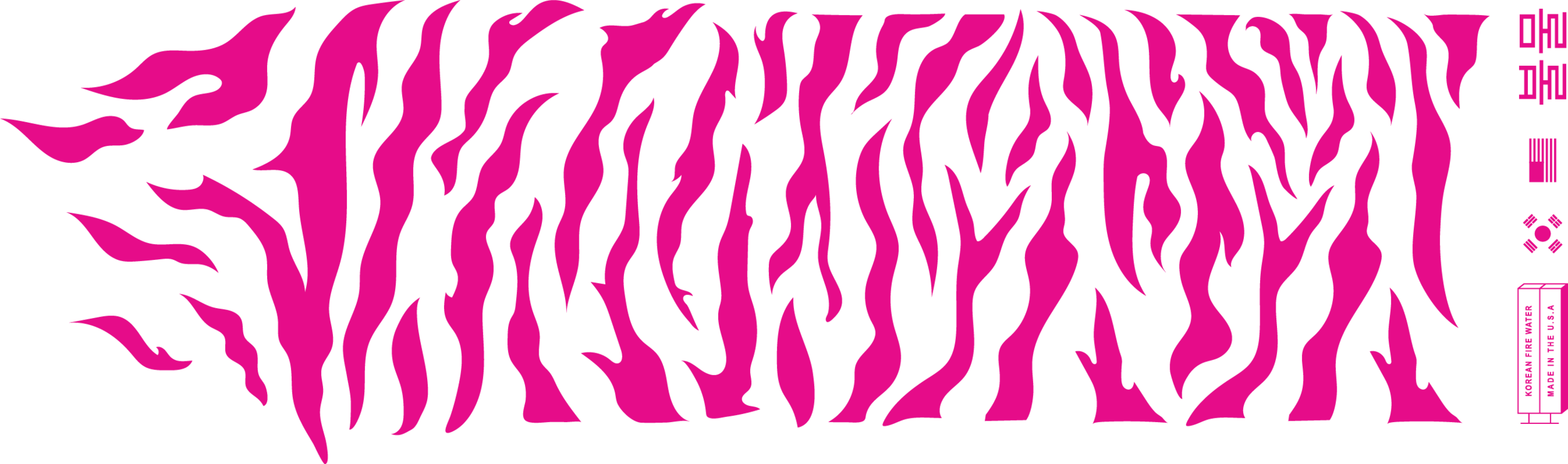
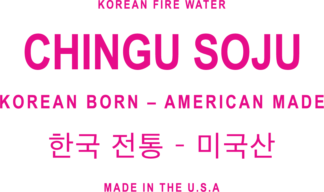
Our logo design was inspired by Soju’s nickname: Korean Fire Water. We also leaned into design elements found on various Korean street signs.
Minwa Style
The brand elements were inspired by the traditional Minwa style of drawing. Minwa is a Korean folk art produced mostly by unknown artists without formal training. It represents the cheerful and optimistic spirit of the Korean people—ideal for a product made for the everyday person.
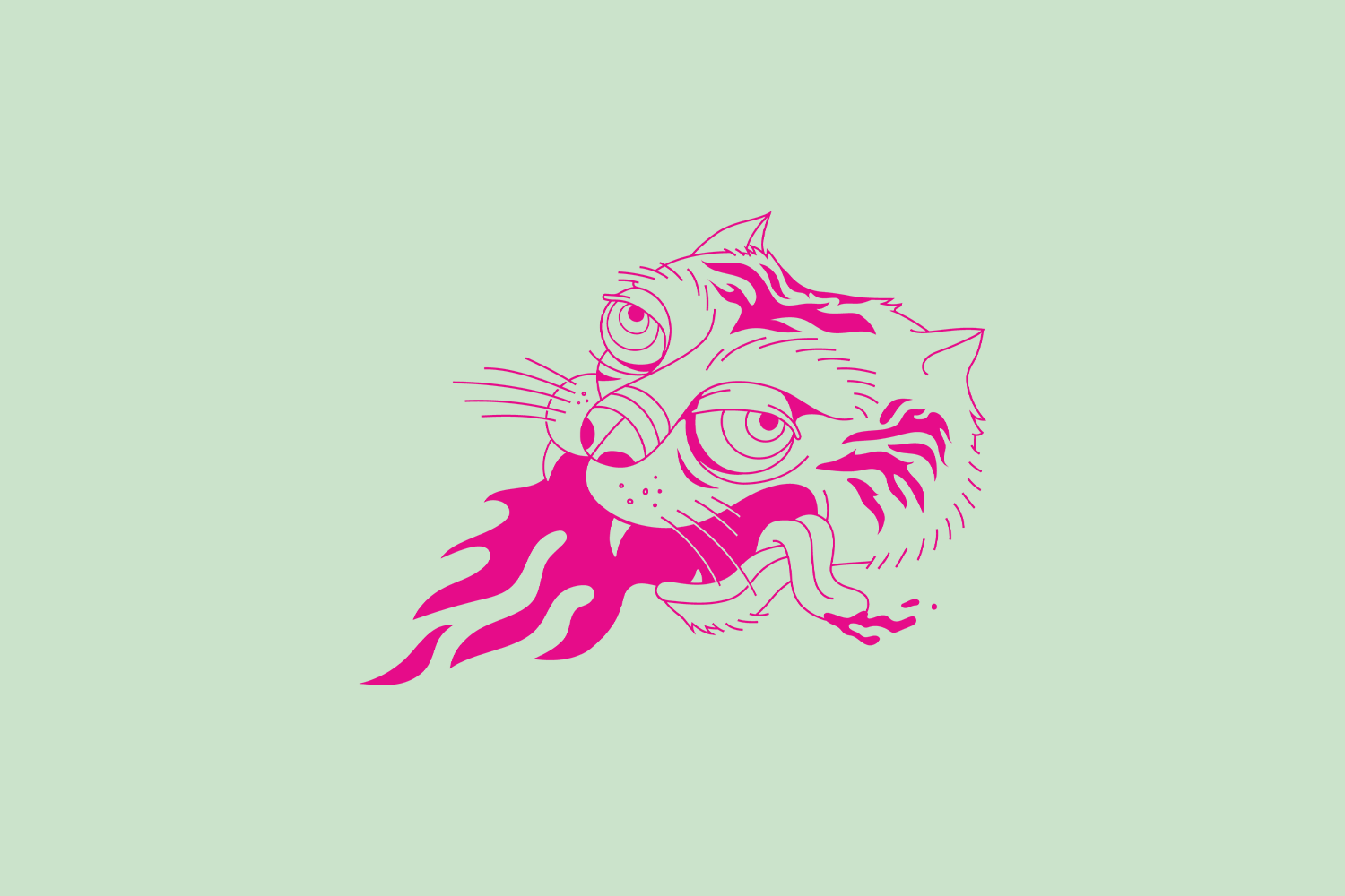
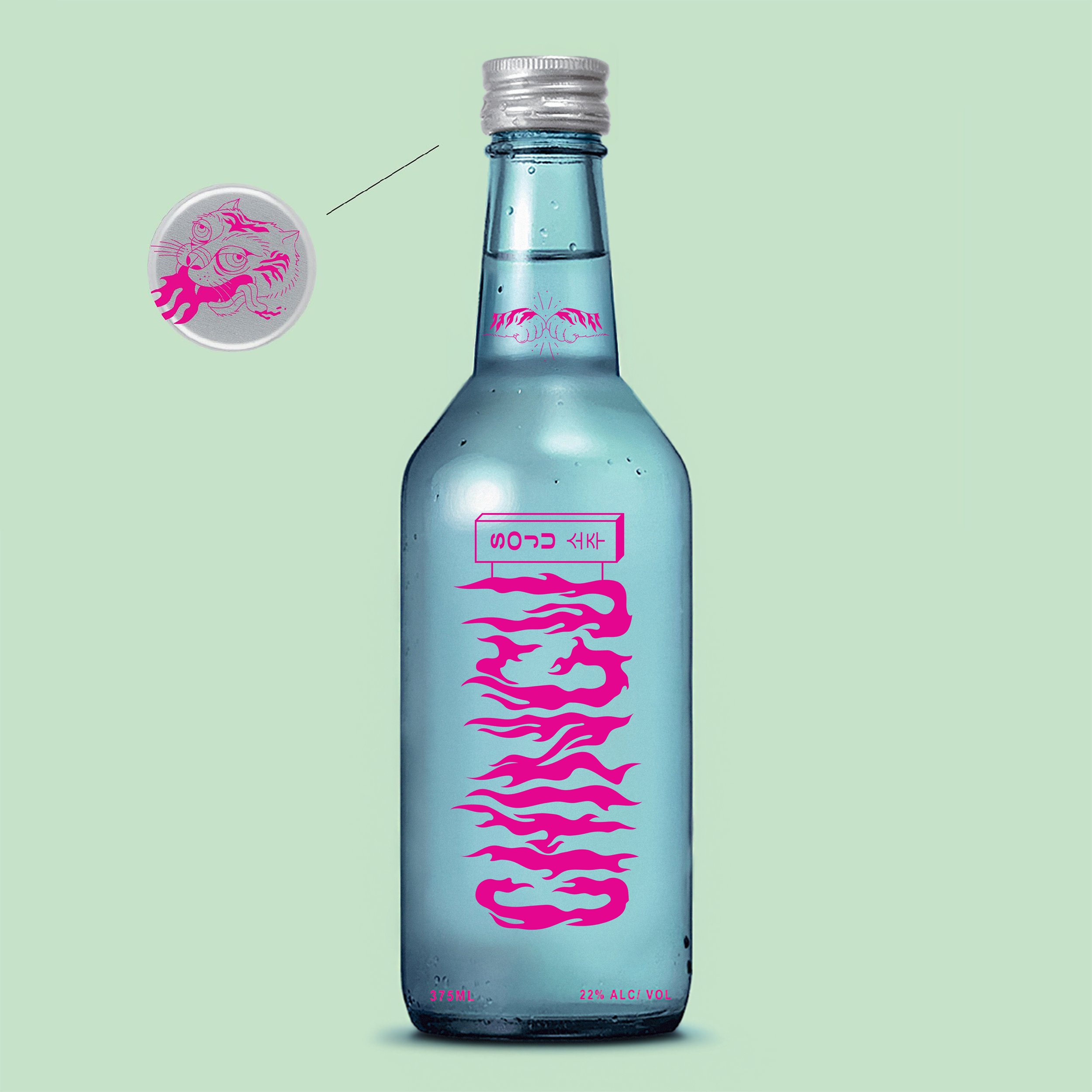
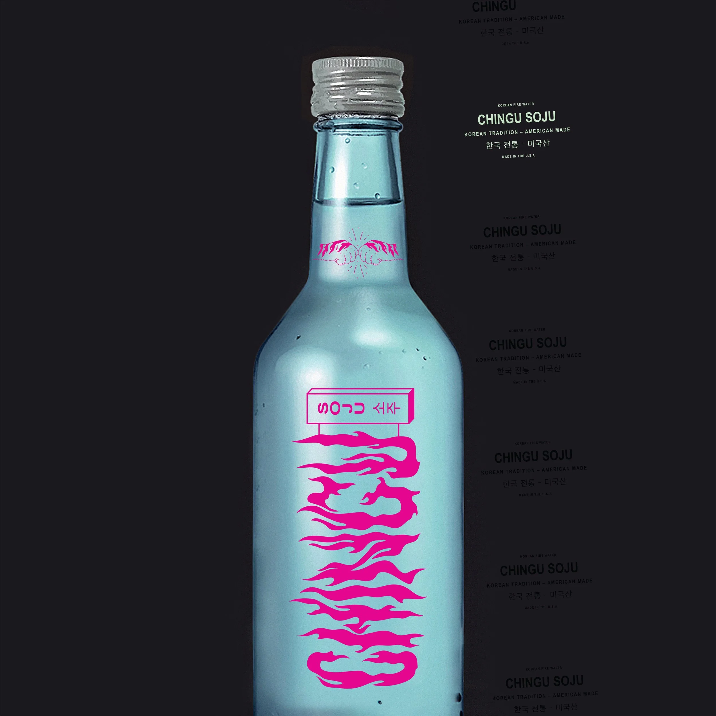
Tiger
The tiger is considered to be the Republic of Korea's guardian animal. It's a familiar, benevolent figure in Korean folklore and mythology. The flames echo tiger stripes as an allusion to Korean folklore.
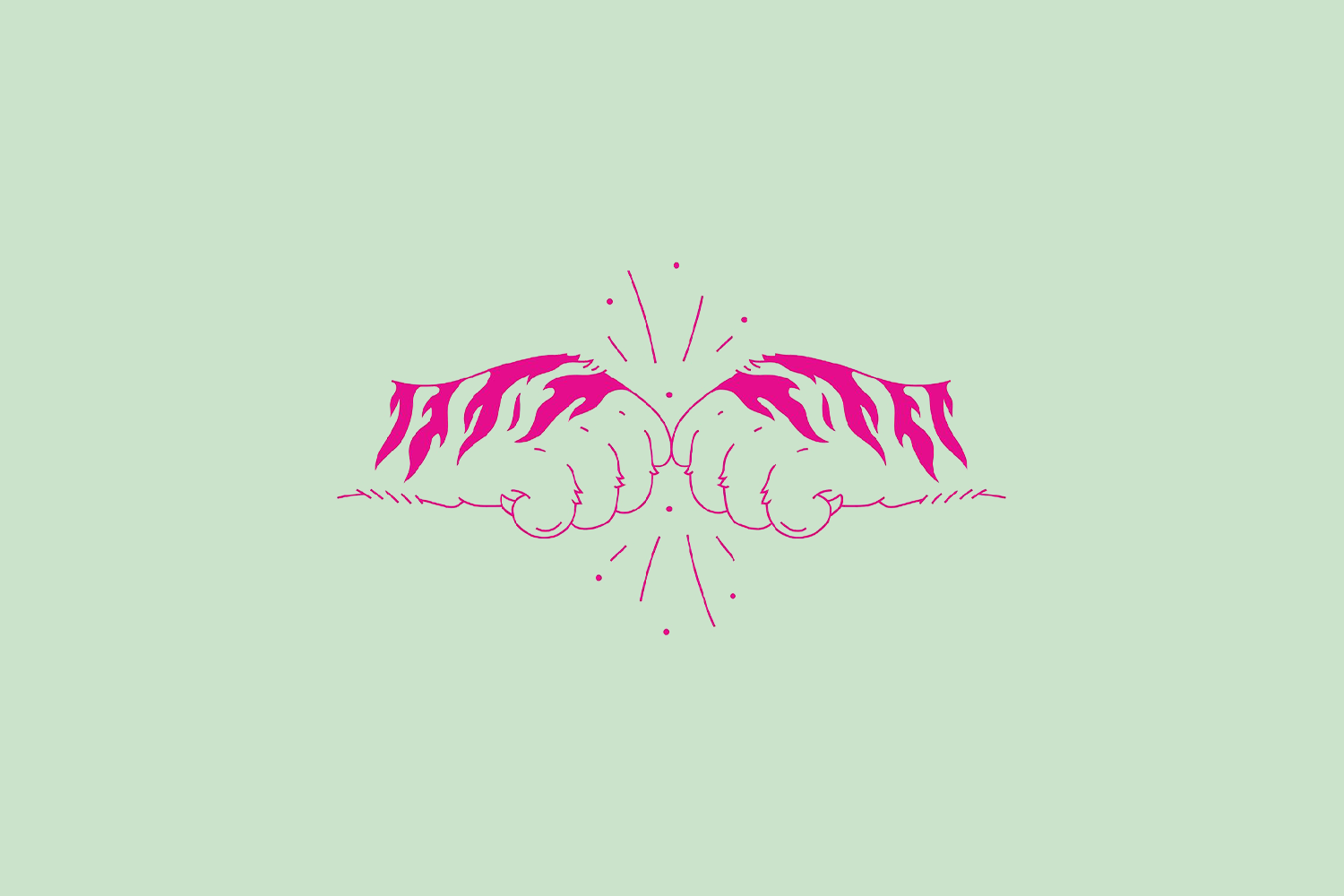
Fist bump
The dap is shown to depict friendship, camaraderie, and all of the things that embody Chingu Soju.

FONT
Clean fonts were chosen to balance out the fiery designs and colors. This balance emphasizes the relationship between expressive Korean traditions and the simple, non-elitist values of Chingu Soju. Even further, these fonts nod to many styles of Korean corner store signs.


Packaging
The packaging was created to stand out on the shelf next to other Korean soju spirits. Bold, youthful, yet still authentic to the Korean culture. A traditional brand, developed for today’s consumer.
MERCH
Because we are targeting a younger demo, the merch was inspired by both American and Korean streetwear brands.

USAGE