Lettuce grow website
WHAT WE DID
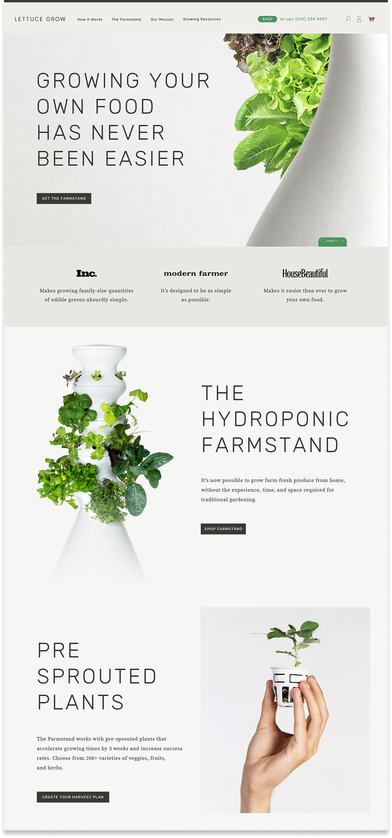
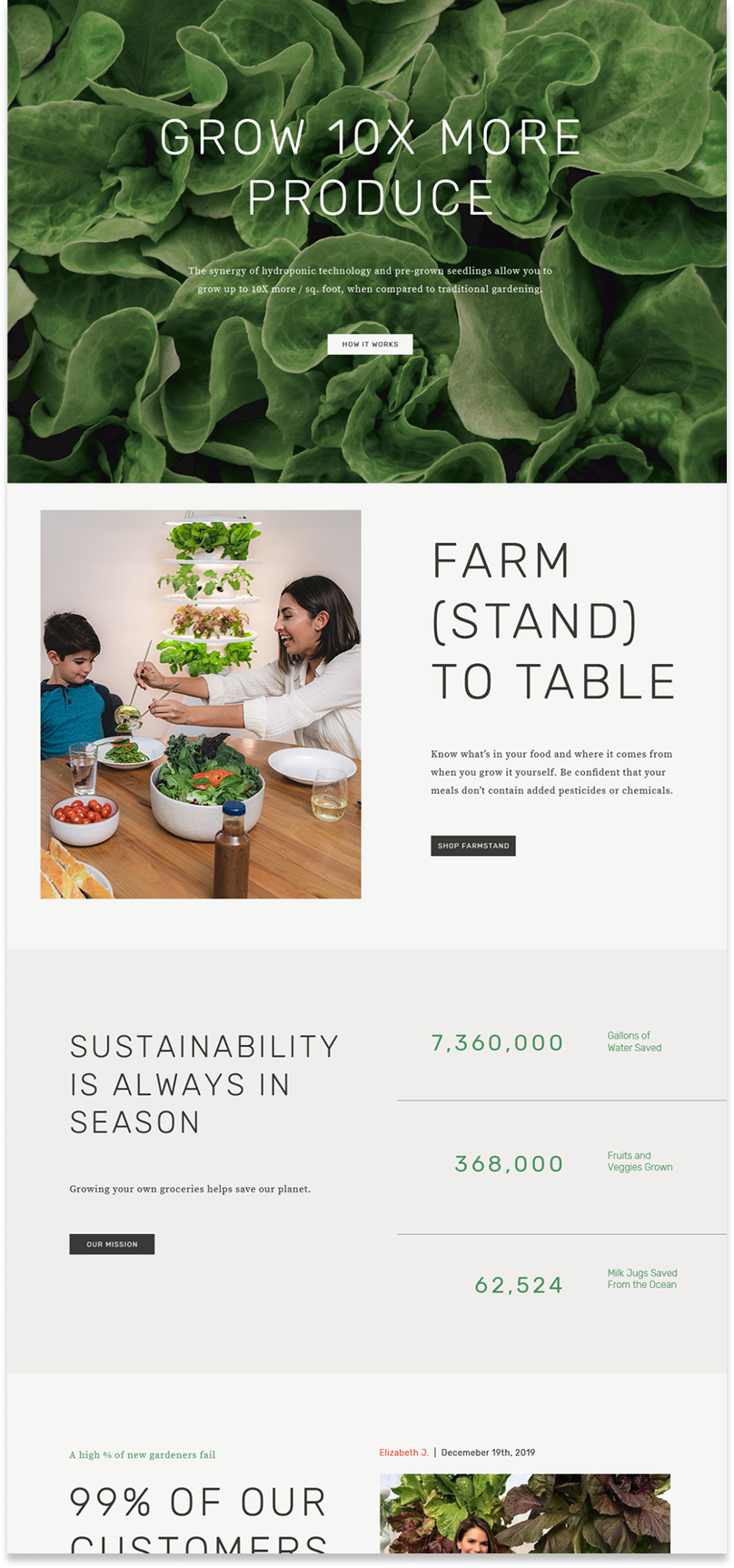
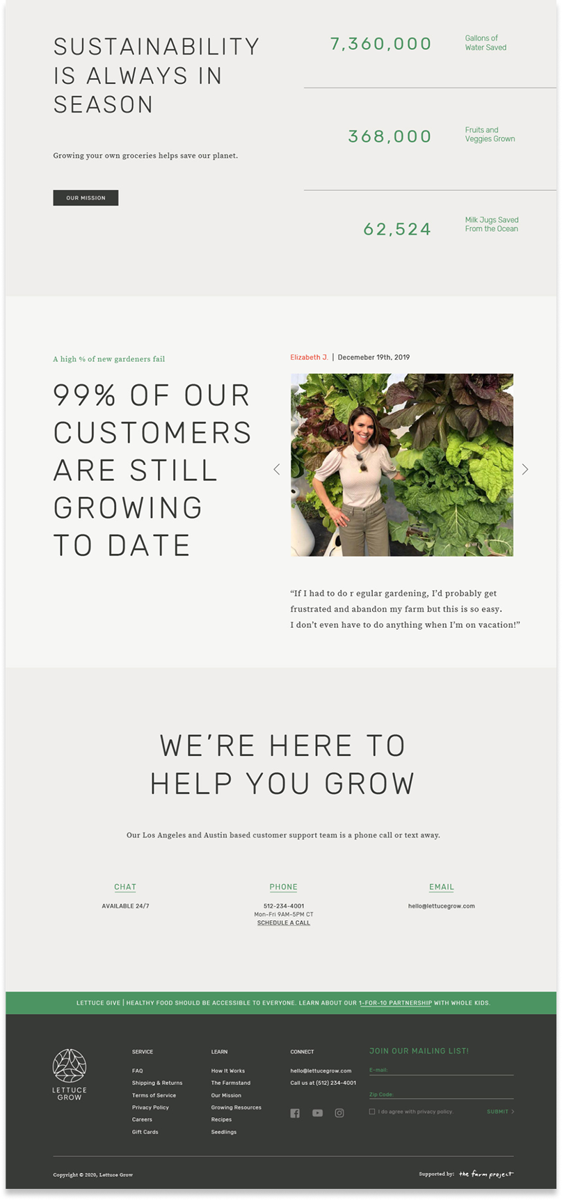
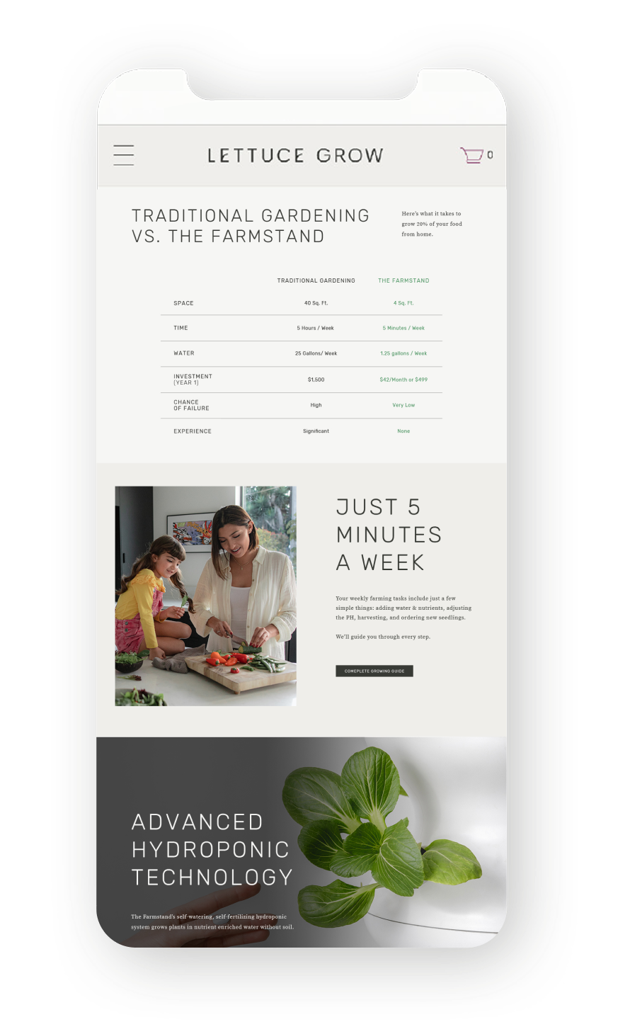
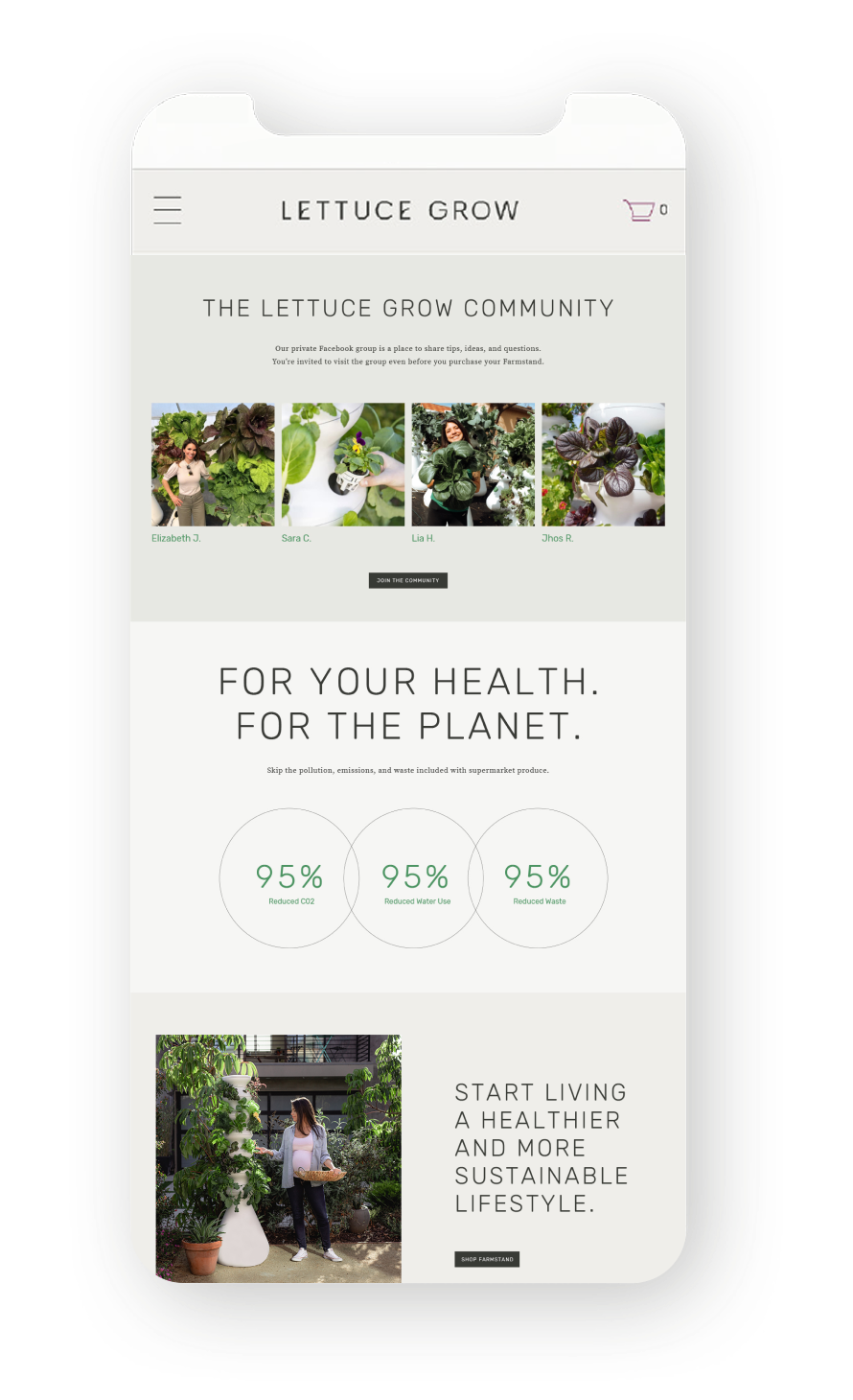
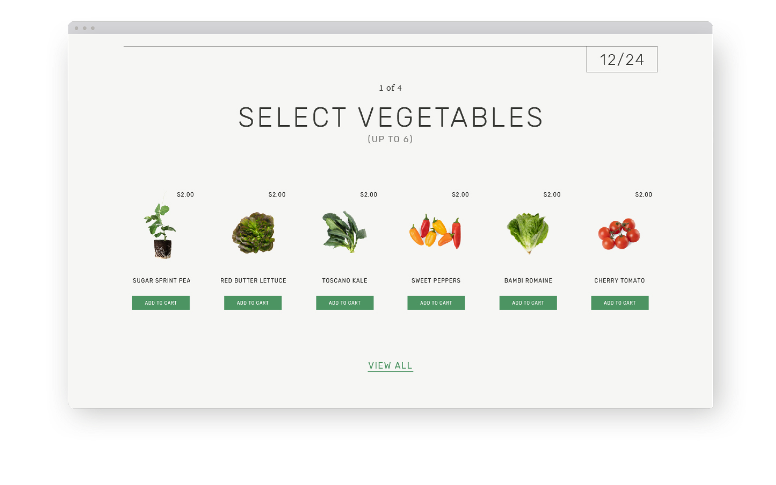
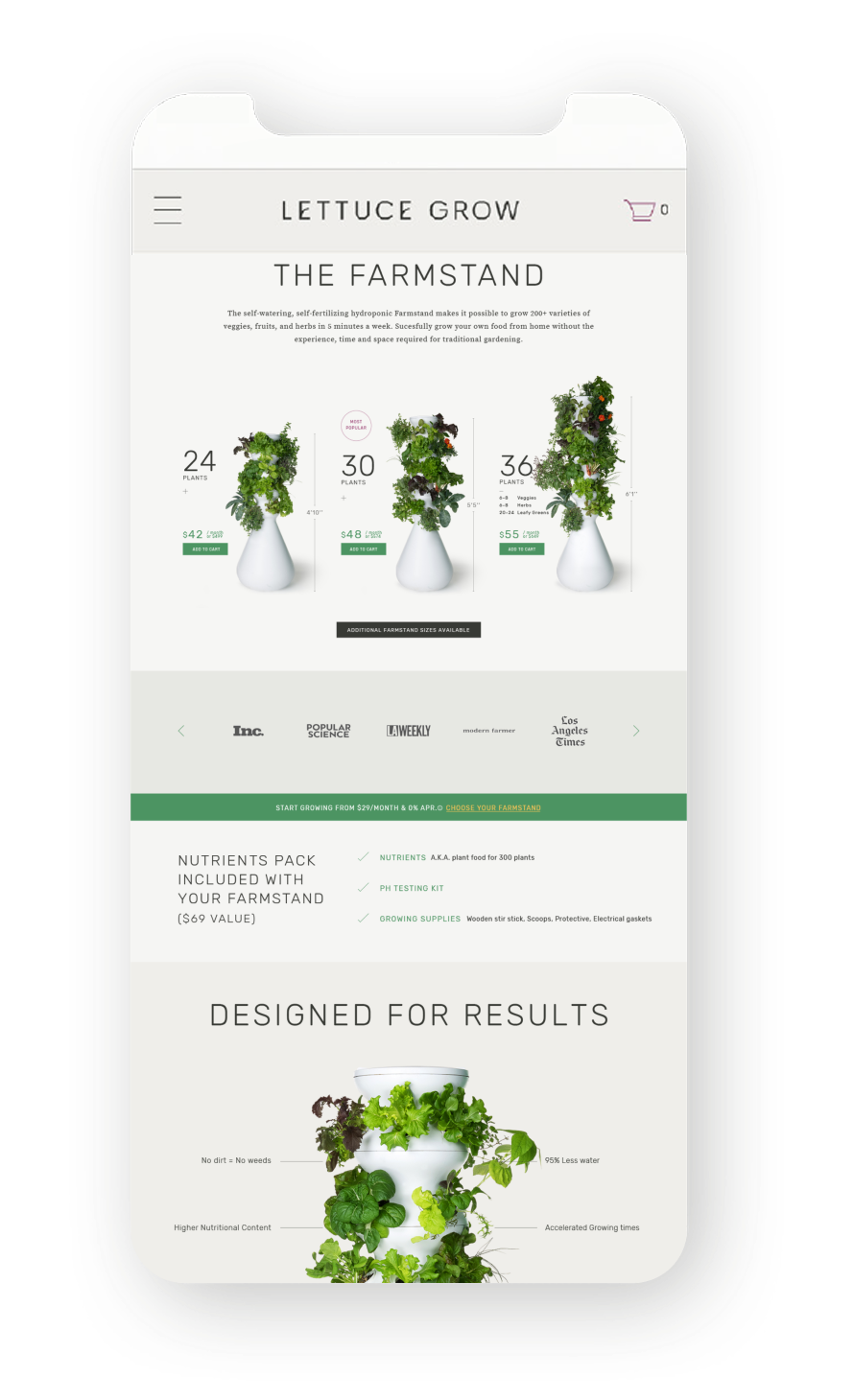
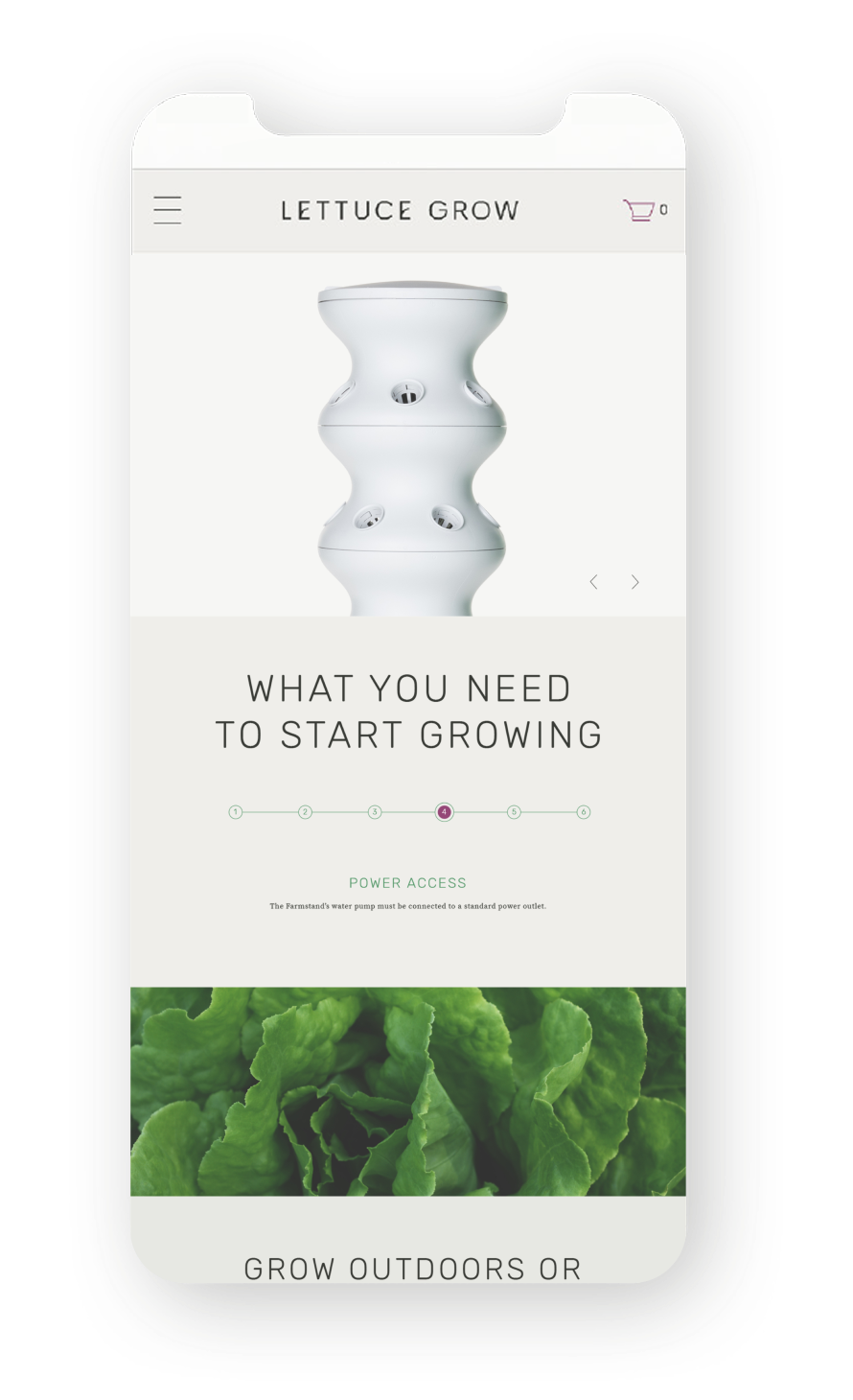
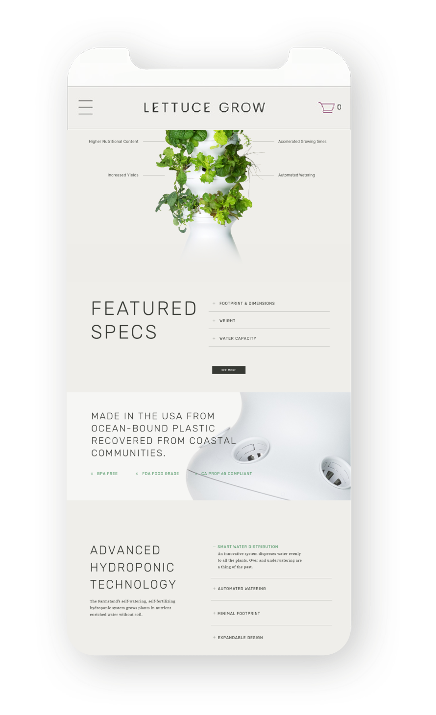
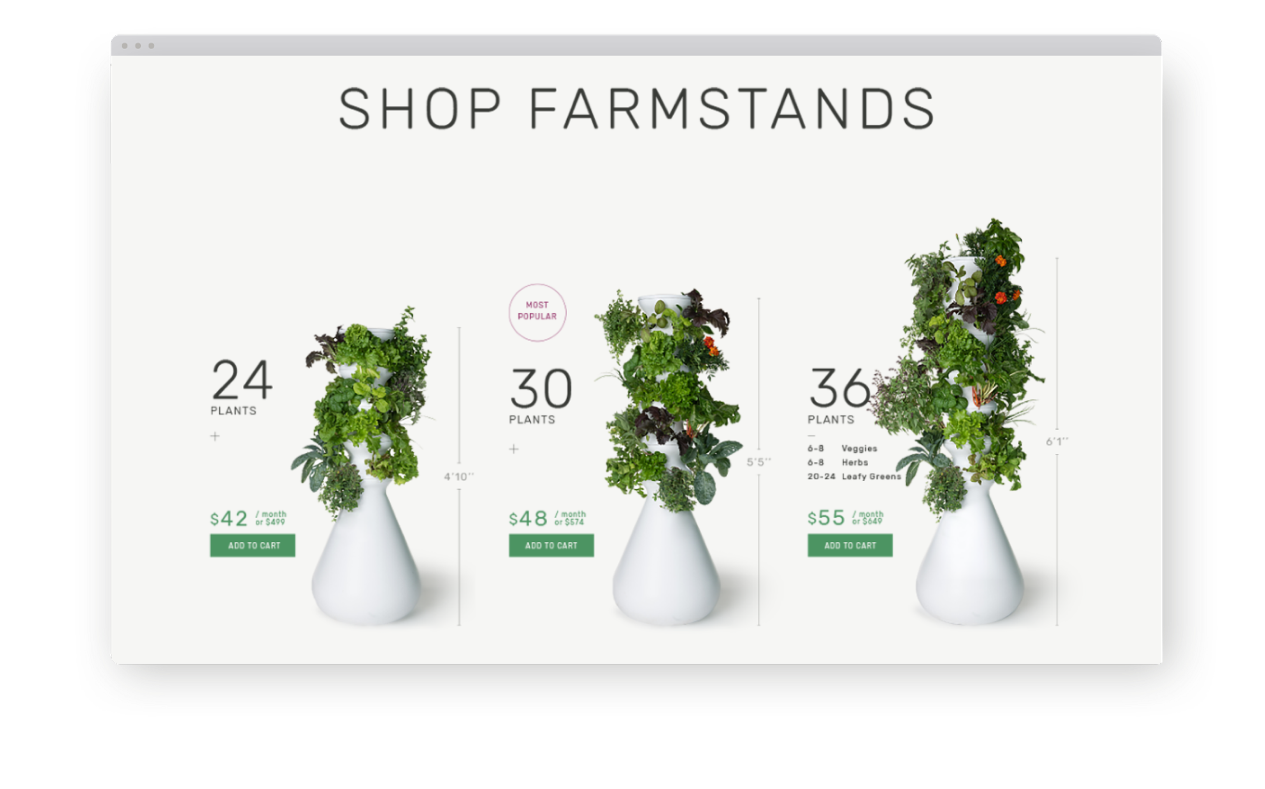
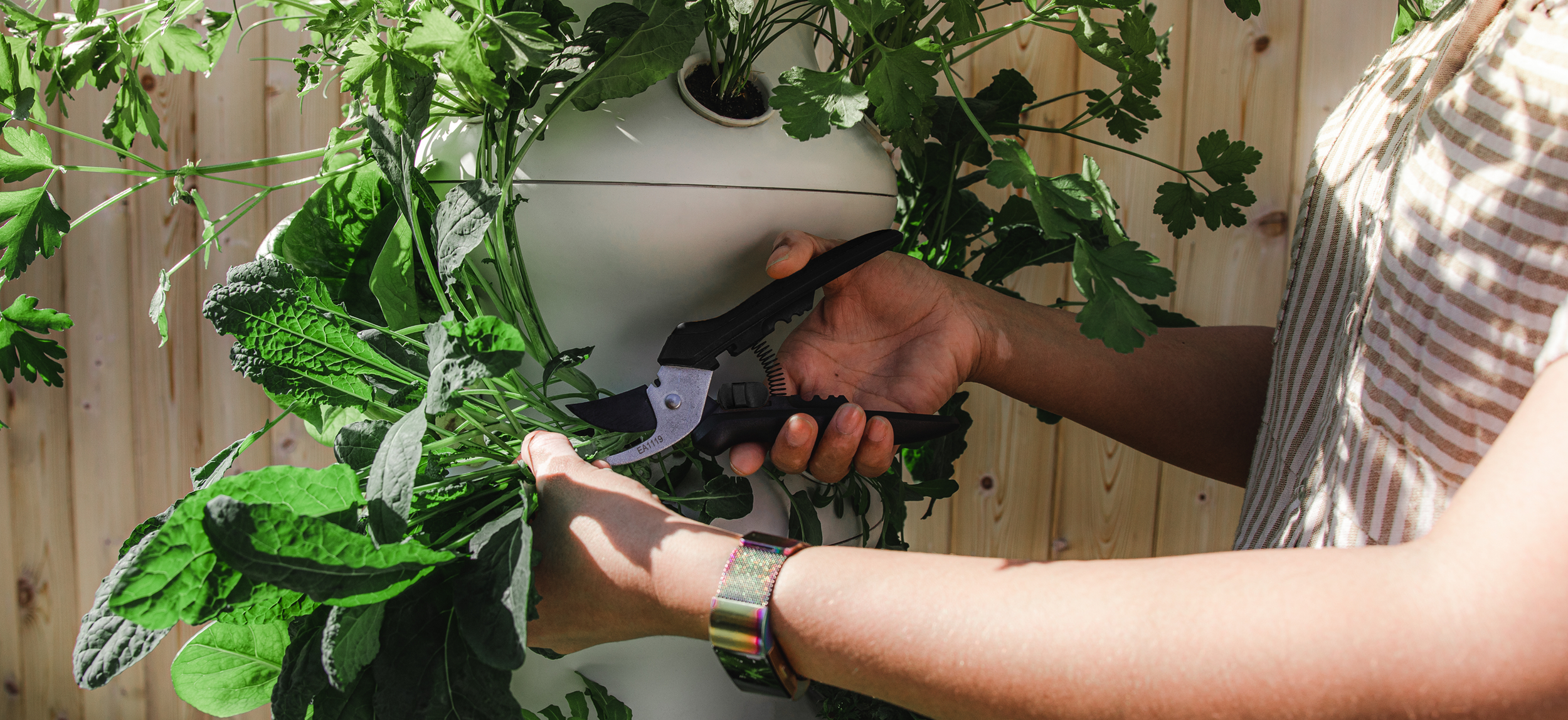
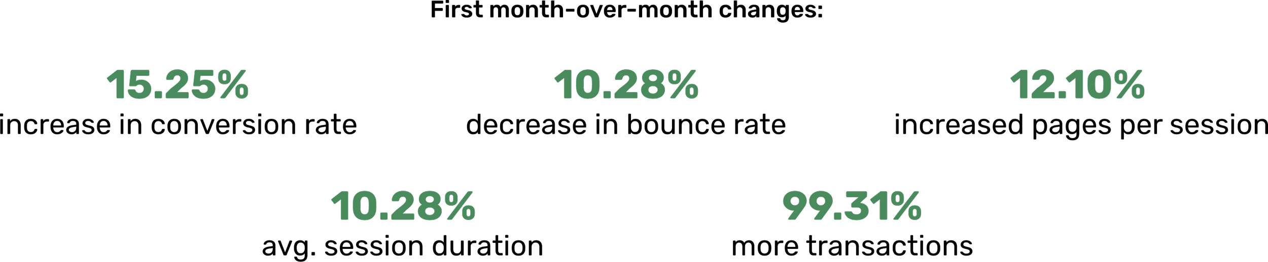
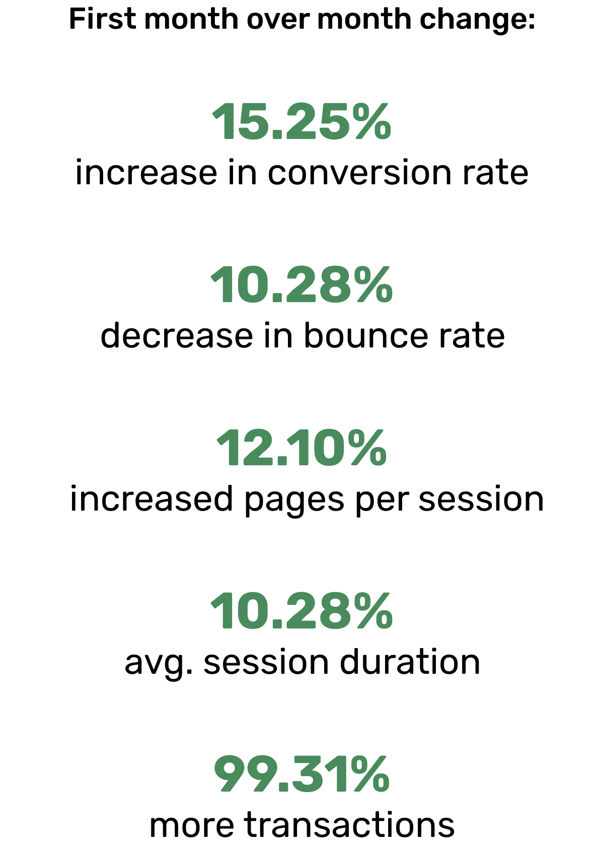
The website was redesigned with simplicity and premium quality in mind, wanting the viewer to know and understand the ease of the Lettuce Grow Farmstand. As the consumer scrolls through the site, we break down every potential buying barrier to present this beautiful system. In the first month after the launch of the new website, Lettuce Grow saw a 15% conversion-rate increase.
User Experience & User Interface
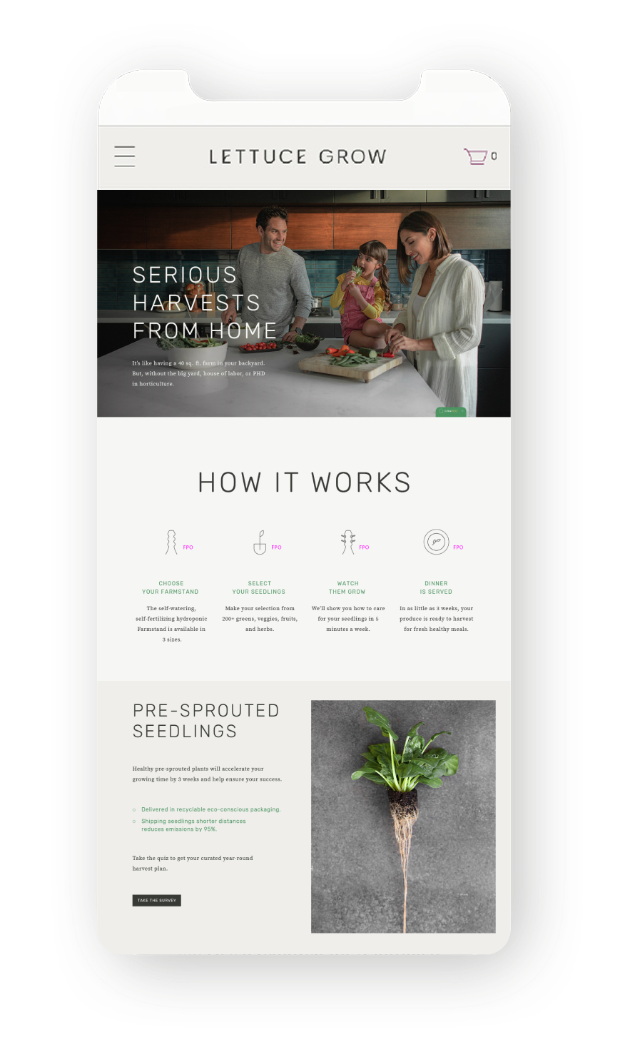
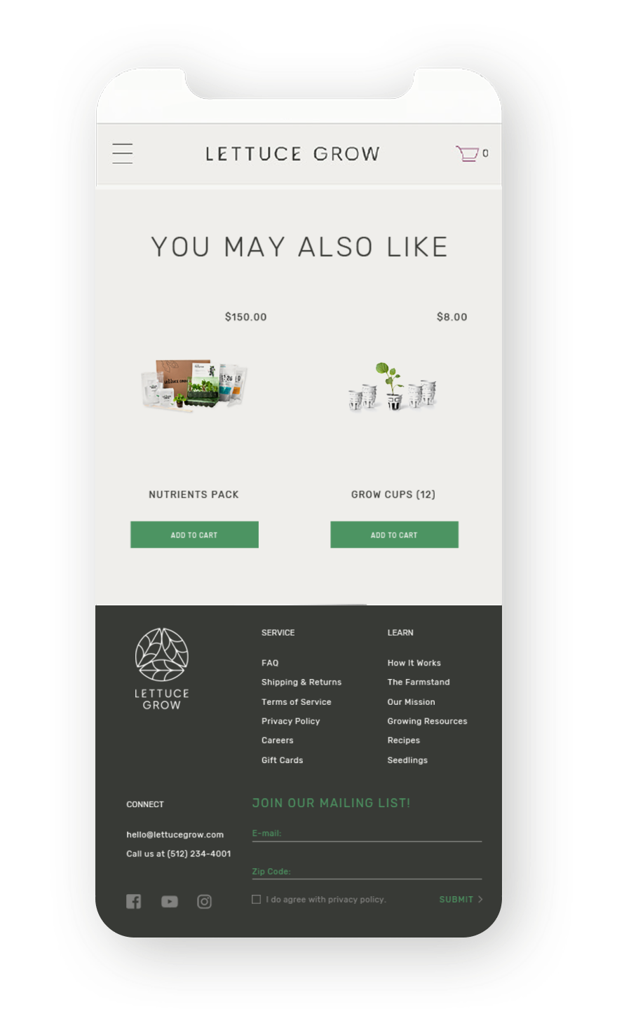
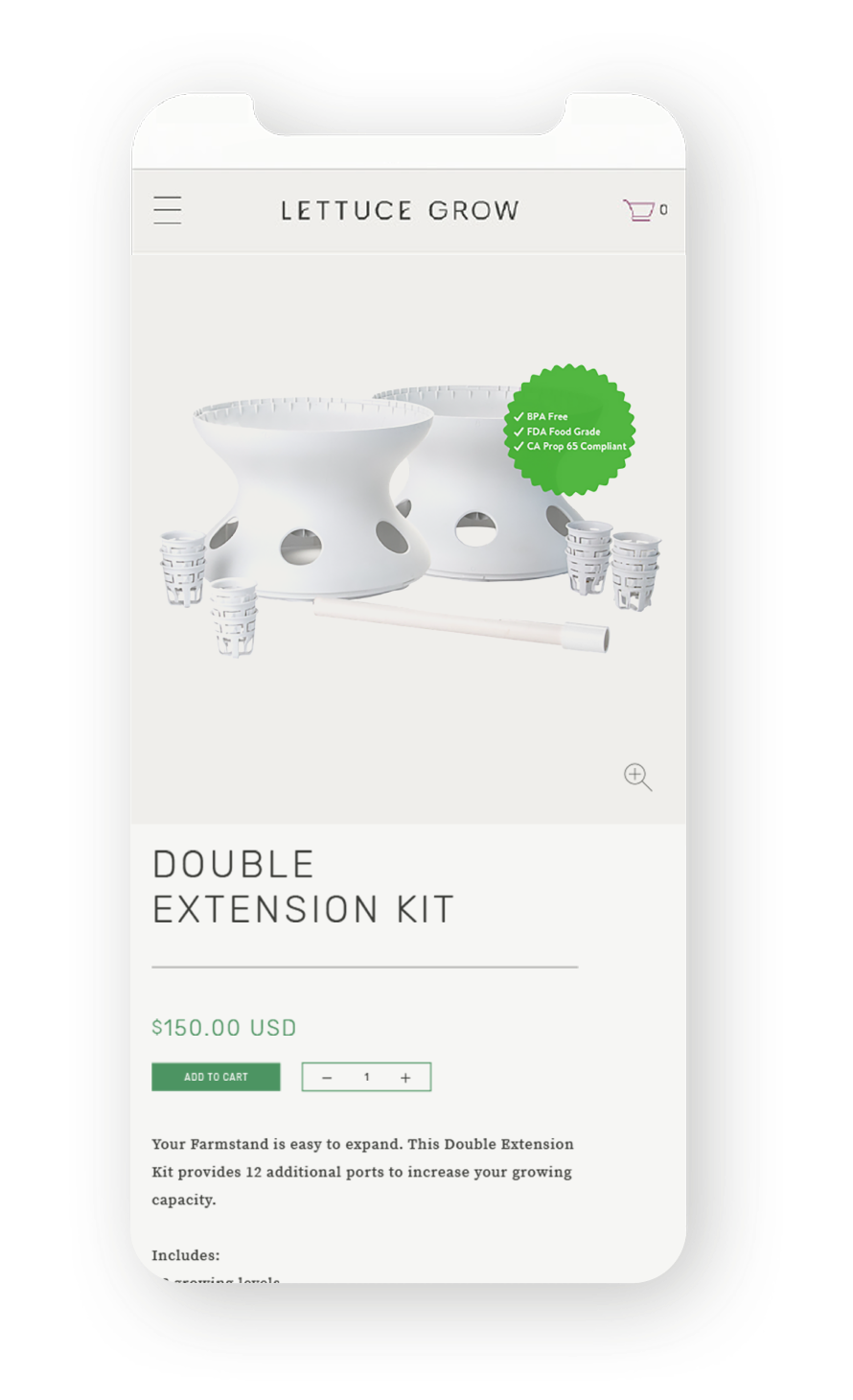
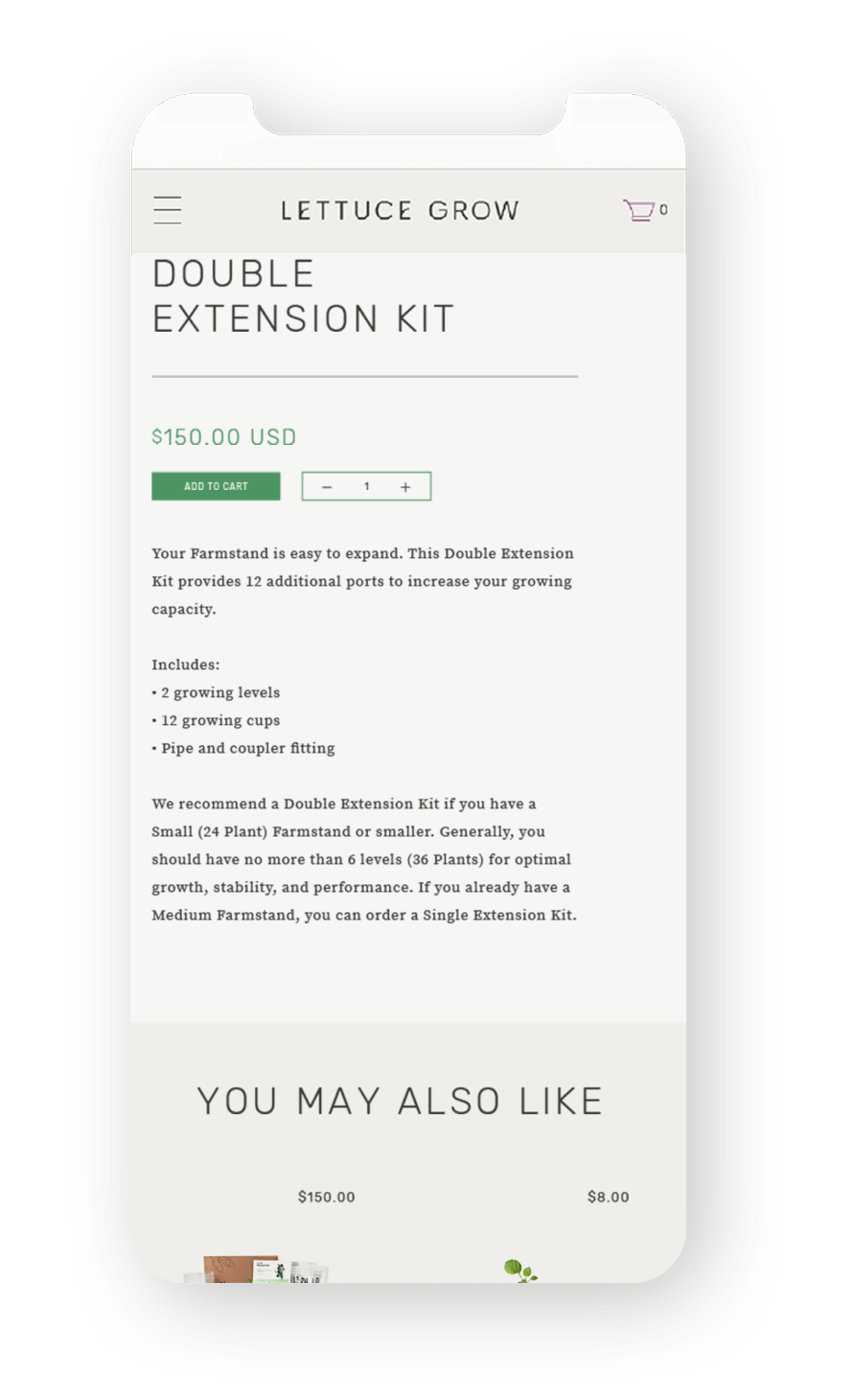
Website
the system
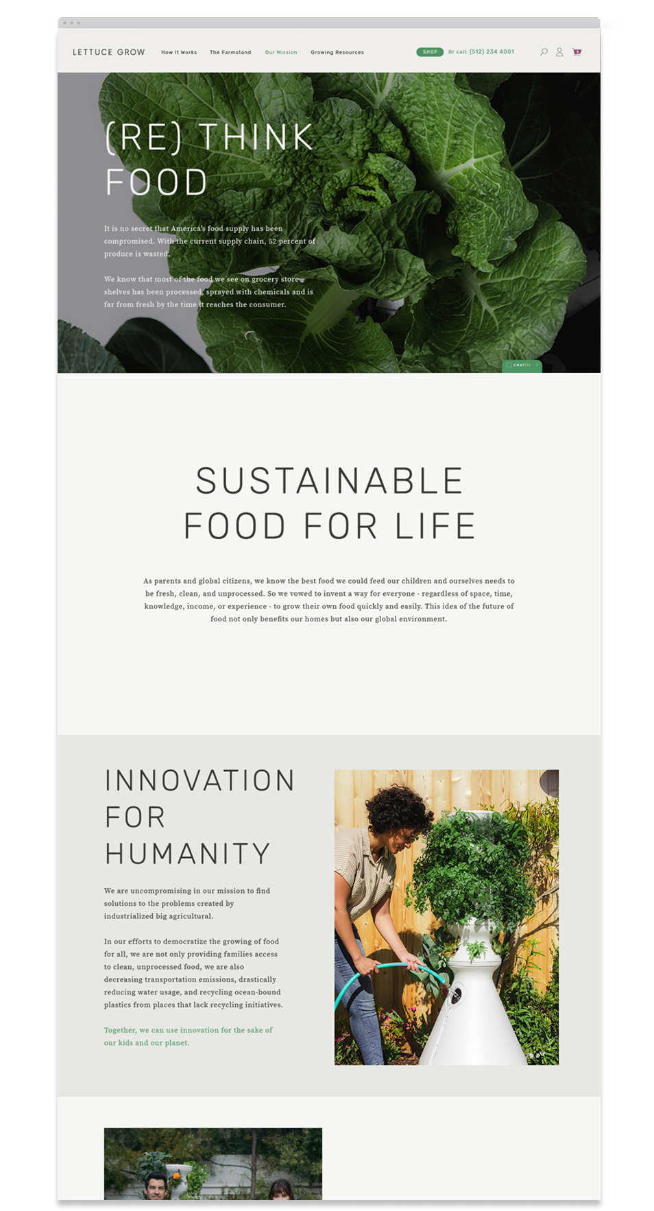
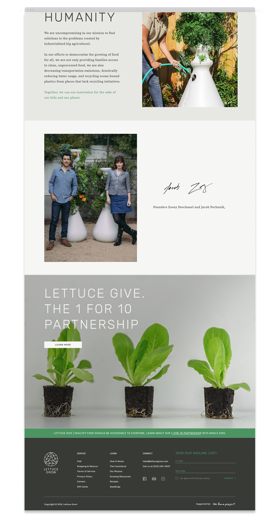
We established the visual foundation of the design system, encompassing typography, color palettes, iconography, and imagery. These elements work together to ensure a cohesive and consistent appearance throughout the website.


the website
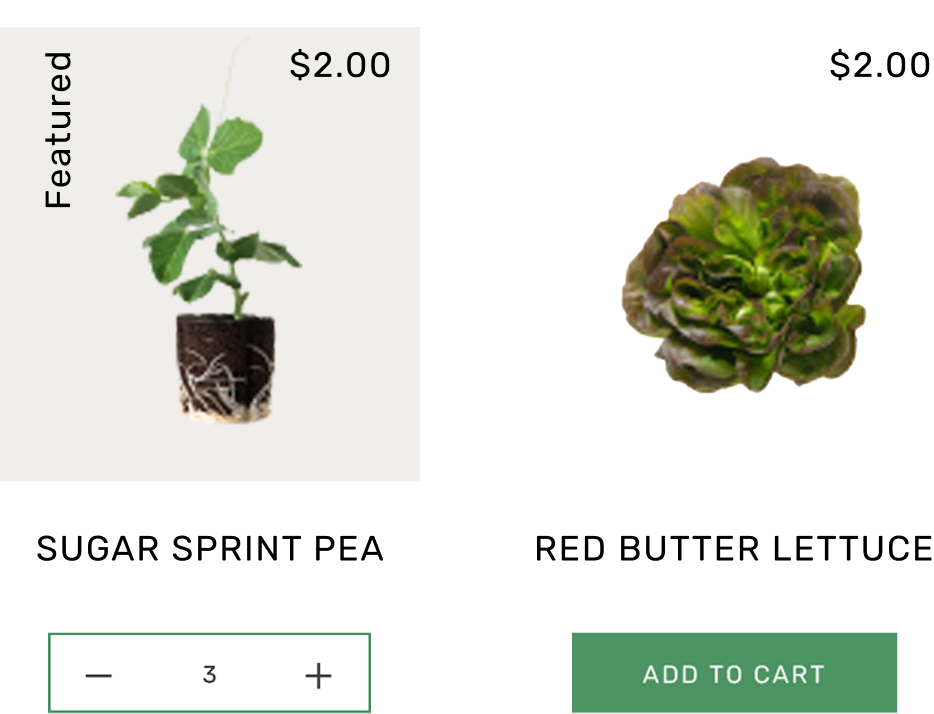
When building the website, our goals were to promote product awareness, provide informative content to support research, deliver valuable resources to help growers make informed decisions, and create engaging content that fosters ongoing relationships and encourages growers to return to the website.